How to create striking, accessible brand colors that make your health coaching business stand out
If you’re building a health coaching business, you’ve probably spent hours looking at other coaches’ websites and Instagram feeds, thinking about what colors would work best for your brand. It’s an exciting part of building your business – but it’s also more strategic than just picking colors you love.
Creating your health coach business color palette is about more than aesthetics. It’s about choosing colors that not only reflect your brand personality but also work effectively across all your digital platforms. One of the most overlooked aspects? Accessibility.
As someone who designs websites for health coaches, I’ve learned that the most beautiful color palettes aren’t always the most functional. That stunning light gray text on a white background might look elegant, but if your potential clients can’t read it easily, you’re missing an opportunity to connect with them.
In this guide, I’ll walk you through exactly how to pick your health coach business color palette with both style and accessibility in mind. You’ll learn how to create colors that not only look beautiful but also serve every visitor to your website. Plus, I’ll share three pre-tested color palettes that you can use right away in your health coaching business.
Think of this as your color strategy session – where beauty meets functionality, and your brand colors work as hard as you do.
Quick Tip: Before we dive in, remember that your brand colors will be with you for a while. Take notes on what resonates with you as we go through this guide, and don’t be afraid to test different combinations.
Table of Contents
Why Color Accessibility Matters for Your Health Coaching Business
Accessibility might not be the first thing on your mind when choosing brand colors for your health coaching business. After all, there are so many aspects of your business to consider – your program offerings, content creation, client acquisition, etc. But here’s why your health coaching business color palette needs to prioritize accessibility: it directly impacts how effectively you can communicate with potential clients.
Think about it. Your colors show up everywhere – your website, social media graphics, PDFs, worksheets, and email newsletters. If someone can’t easily read your content because there isn’t enough contrast between your text and background colors, they might miss out on your valuable insights about health and wellness. Or worse, they might leave your website altogether.
Here’s what I often see: A health coach chooses a beautiful, soft palette with light sage green text on a cream background. It looks peaceful and wellness-oriented – perfect for their brand aesthetic. But when their ideal client visits their website, they have to squint to read the text. That peaceful feeling they intended to evoke is quickly replaced by frustration.
Remember, your audience might include:
- People reading your website on their phones in bright sunlight
- Potential clients with varying degrees of visual impairment
- Busy professionals quickly scanning your content during their lunch break
- Individuals viewing your site on screens with different brightness settings
Creating an accessible health coaching business color palette isn’t about limiting your creativity – it’s about making intentional choices that help you serve your audience better. After all, isn’t that what health coaching is all about?
Quick Tip: Think of color accessibility as an extension of your commitment to helping others. Just as you want to make health and wellness accessible to your clients, your content should be accessible too.

Understanding Color Contrast for Impact and Readability
Let’s talk about what makes colors work well together – or not. When building your health coaching business color palette, contrast is your best friend. But what exactly is contrast, and how do you know if your colors have enough of it?
Contrast is the difference between two colors that makes them clearly distinguishable from each other. Think about reading black text on a white background – that’s high contrast and easy to read. On the flip side, light gray text on a white background? That’s low contrast and can be challenging to read.
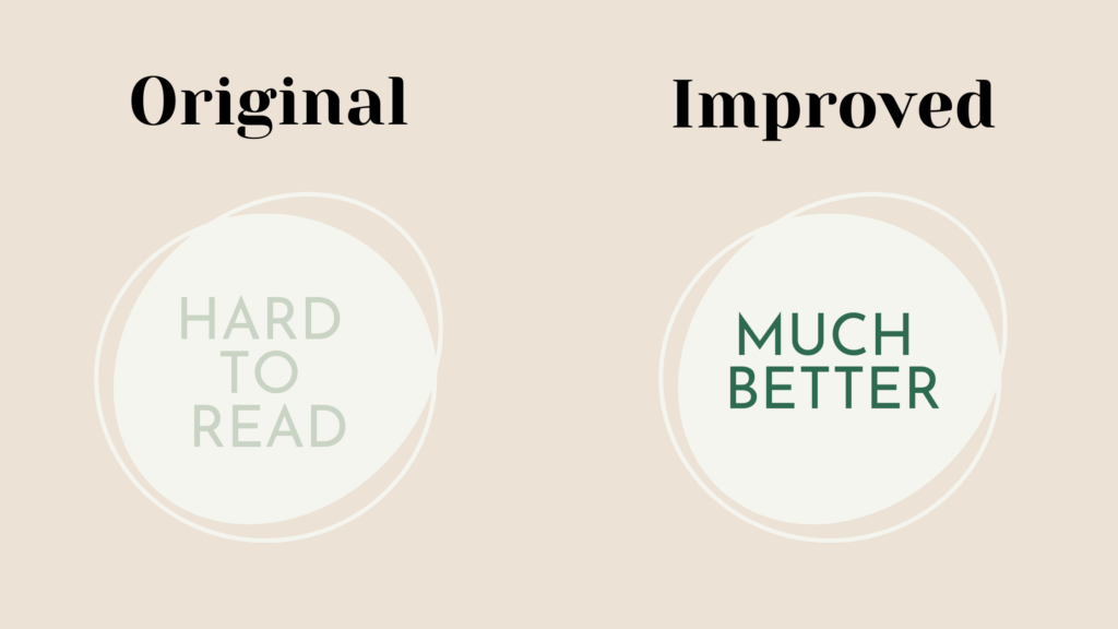
Here’s an example:
- Original combination: Light sage green text (#C9D4C5) on a cream background (#F5F5F0)
- Improved combination: Deep sage green text (#2D6A4F) on the same cream background

The second combination not only looks more professional but ensures your message is clear and readable for everyone visiting your site.
Quick Tip: Test your color combinations in different contexts. What works for a large headline might not work for body text, and what looks great on your computer might be harder to read on a phone.
Common Color Accessibility Mistakes to Avoid
When creating your health coaching business color palette, there are some common pitfalls I see again and again. Let’s talk about how to avoid them so you can build a brand that’s both beautiful and functional.
The “Too Light” Text Trap
Those gorgeous, airy wellness websites with super light text might look serene and minimal, but they’re often sacrificing readability. Light gray or pastel text on a white background is one of the biggest accessibility mistakes in health coaching websites. Remember: your website needs to communicate your expertise, not just look pretty.
The “Too Many Colors” Tangle
Sometimes, in an effort to create an energetic, vibrant brand, health coaches choose too many bold colors. While your health coaching business color palette can absolutely include vibrant hues, too many competing colors can make your content hard to focus on. Stick to one or two bold colors and support them with neutrals.
The “Colored Text on Colored Background” Challenge
Using colored text on a colored background – like green text on a blue background – can be particularly tricky. Even if both colors are part of your palette, they might not have enough contrast to work together for text. Save these color-on-color combinations for decorative elements, not important content.
The “Forgetting About Links” Fumble
Many health coaches forget to consider how their color palette will work for clickable links. If your links blend in too much with regular text, visitors might miss important calls to action or resource links. Your link color should stand out while still maintaining good contrast with the background.
Quick Tip: When choosing colors for your health coaching business, always test them in their actual intended use – headlines, body text, buttons, and links – not just as swatches in your design program.
How to Test Your Brand Colors for Success
While there are plenty of professional color testing tools out there, you don’t need anything fancy to create an accessible health coaching business color palette. Here are some practical ways to test your colors and make sure they work for your brand.
The Squint Test
This might sound simple, but it’s incredibly effective. Pull up your color combinations and squint your eyes. Can you still easily distinguish between the text and background? If elements blur together, you need more contrast.
The Mobile Check
Preview your color combinations on your phone – both indoors and outdoors. Your health coaching business color palette needs to work everywhere, including when someone’s reading your website on their phone during their lunch break outside.
The Screenshot Method
Take a screenshot of your color combinations and convert it to grayscale (most photo editing apps, including your phone’s, can do this). If you can’t easily tell the difference between your colors in grayscale, they probably don’t have enough contrast for accessibility.
The Distance Test
Pull up your website or a sample of your colors on your computer and take a few steps back. Can you still read everything clearly? If not, you might need to increase the contrast or adjust your color choices.
Browser Tools
Most modern web browsers have built-in tools to test color contrast. Right-click on any text on a webpage and select “Inspect” to access developer tools, where you can check contrast ratios for free.
Quick Tip: Remember, if you’re ever unsure about your color combinations, err on the side of more contrast rather than less. It’s better to have text that’s easily readable than to maintain a specific aesthetic at the cost of accessibility.
Creating Your Health Coaching Business Color Palette: Key Combinations That Work
When building your health coaching business color palette, there are certain color combinations that consistently perform well while maintaining accessibility. Let’s break down what makes a successful palette structure:
The Foundation Every health coaching business needs:
- A light background color for primary content
- A dark, readable text color
- A bold accent color that captures attention
- 2-3 supporting colors that enhance your brand story
What Sets Successful Palettes Apart
The most effective health coaching business color palettes share these characteristics:
- They use contrast strategically
- They include one standout color that becomes recognizable
- They maintain readability across all combinations
- They provide enough variety for different content needs
- They work across both digital and print materials
Finding Your Brand’s Color Story
Consider what your colors say about your approach to health coaching:
- Are you more clinical and precise, or warm and nurturing?
- Do you focus on energy and vitality, or peace and balance?
- What colors reflect your coaching methodology?
- How can your palette support your message?
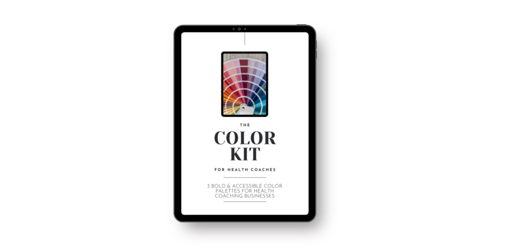
Ready to see this in action? I’ve created three complete, pre-tested color palettes specifically for health coaches. Each includes six perfectly coordinated colors with exact hex codes, contrast ratios, and usage guidelines.
Download the Free Health Coach Color Kit

In this free guide, you’ll get:
- 3 complete, accessible color palettes
- Exact hex codes for each color
- Guidelines for using each color effectively
Implementing Your Health Coaching Business Colors in Showit
Now that you understand how to choose accessible colors, let’s talk about putting them into action. The beauty of working with your health coaching business color palette in Showit is that it makes color implementation both simple and consistent across your site. (Read my breakdown of why Showit is the best Website Platform for Health Coaches here.)
Getting Your Colors Into Showit
One of my favorite features of Showit is how easy it makes color management. You can import your brand colors directly into the platform, creating a custom palette that’s available throughout your design process. This ensures consistency and saves you from constantly copy-pasting hex codes.
Where Your Colors Should Show Up
Let’s break down how to use your palette effectively:
Primary Content Areas:
- Headlines: Use your darkest, most readable color
- Body text: Stick with high-contrast colors for easy reading
- Backgrounds: Your lightest colors work best here
- Buttons and CTAs: This is where your bold accent color can shine
Supporting Elements:
- Dividers and borders: Lighter accent colors work well
- Icons: Your secondary colors can add visual interest
- Hover states: Try using your bold color for interactive elements
- Decorative elements: This is where you can play with color combinations
Quick Tip: Save your colors in Showit’s brand color panel for easy access across every page of your site.
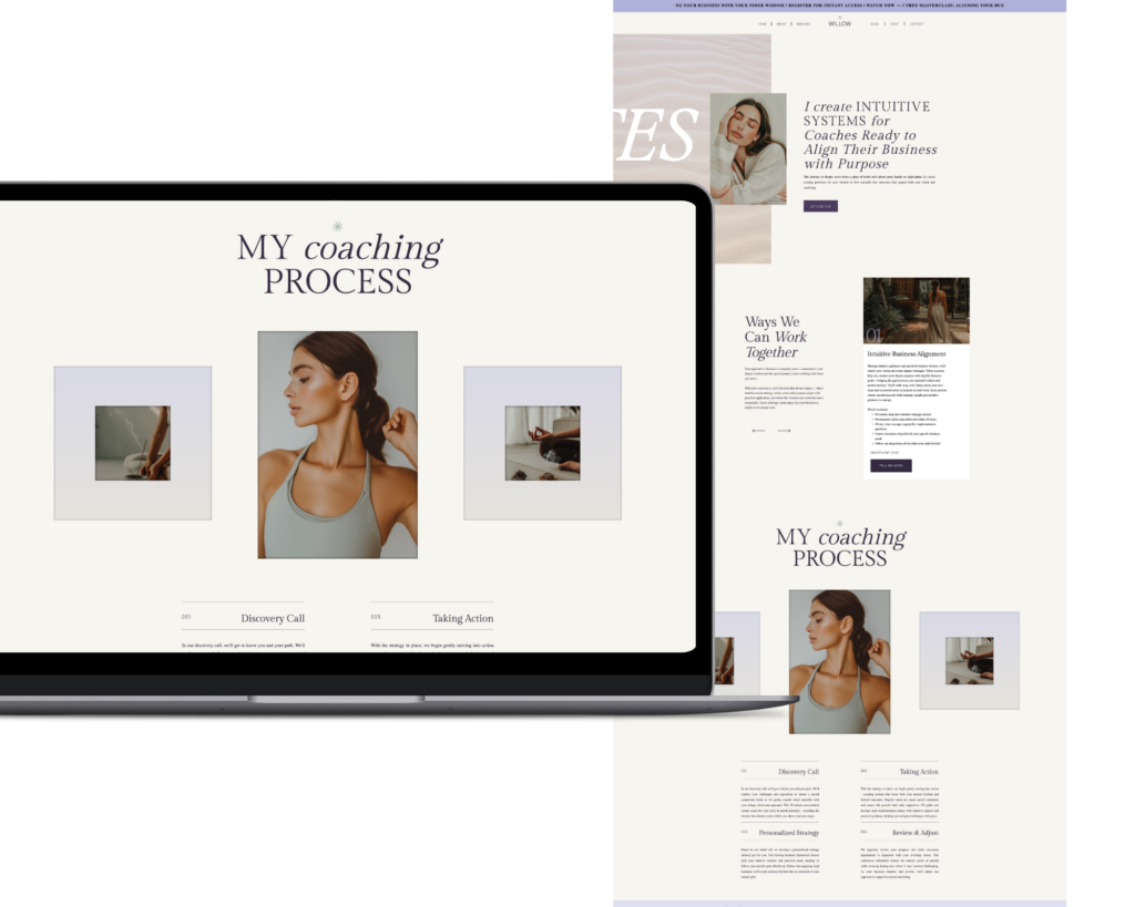
Ready to put these color palettes into action? My Showit templates for health coaches are designed with accessibility in mind, featuring thoughtfully curated color combinations that maintain perfect contrast while letting your personality shine through. Whether you’re drawn to the earthy warmth of Golden Milk, the vibrant energy of Matcha, the rich depth of Kombucha, or the serene flow of Blue Spirulina, each template can be customized with your chosen health coaching business color palette – or use the built-in colors that are already tested for accessibility and impact.

The Reality of Color in Your Health Coaching Business
Creating your health coach business color palette might seem like a small detail in the grand scheme of building your practice, but it’s these thoughtful touches that set professional brands apart. When you choose colors that are both beautiful and accessible, you’re showing your commitment to serving every potential client who visits your site.
Remember, your brand colors are more than just a design choice – they’re part of how you communicate your message and values as a health coach. By choosing colors that work for everyone, you’re creating a more inclusive, professional, and effective online presence.
Ready to level up your brand with accessible, impactful colors? Download the Free Health Coach Color Palette Guide and start building a brand that looks as professional as the services you offer.
