

")
")
")
")


Let’s be honest: you’re building a business while juggling client work, content creation, and probably a day job. Choosing fonts feels like one more thing on an endless to-do list. It’s not as simple as just choosing fonts that pair well together. The questions alone are overwhelming:
How many fonts should a brand have?
Where can I find said fonts?
How do I know if I have the right license to use fonts?
How do I know which one matches the style of my business?
Table of Contents
We’ll cover all of these questions in this post but let’s start with common font mistakes I see coaches making when it comes to choosing their fonts so you can avoid them:
Mistake #1: The “More Fonts = More Personality” Trap
They think variety equals visual interest. Headlines in a bold script, subheads in all caps sans-serif, body copy in a different sans-serif, pull quotes in yet another serif, and captions in whatever font came with your design tool.
The result looks busy, unprofessional, and confusing. Your audience’s brain has to work overtime just to read your content—and confused visitors don’t become paying clients.
Mistake #2: The “One Font Fits All” Problem
You pick Arial (or worse, Times New Roman) and call it done. Everything from your logo to your Instagram posts uses the same typeface at different sizes.
This approach feels safe, but it’s actually sabotaging your credibility. Without font hierarchy, your content looks flat and amateur. There’s no visual distinction between your most important message and your footnotes.
Both approaches cost you clients. Here’s the deal. 2-fonts is your sweet spot. Let’s get into why it works better than either extreme.
How Many Fonts Should a Brand Have: the Strategic 2-Font Rule (And Why It Works)
Two fonts give you enough variety to create visual interest and hierarchy without overwhelming your audience. It’s the Goldilocks zone of typography—not too little, not too much, but just right.
Here’s the psychology behind it: Your brain processes familiar patterns more easily than chaotic ones. When you use a consistent 2-font system across all your marketing materials, you’re training your audience to recognize your brand instantly.
Think about it. You can spot a Coca-Cola ad from across the room, not just because of the red color, but because of their consistent typography. The same principle applies to your coaching brand, whether you’re helping executives level up their leadership skills or supporting entrepreneurs through mindset blocks.
The strategic advantage: Two fonts force you to make intentional design decisions. You can’t just throw another typeface at a design problem—you have to solve it with hierarchy, sizing, spacing, and color instead. This constraint actually makes your brand stronger.
Plus, here’s a practical benefit nobody talks about: managing two fonts is infinitely easier than juggling five. You’ll spend less time second-guessing font choices and more time actually helping your clients transform their lives.
Serif vs Sans-Serif: Your Foundation for Perfect Pairing
Before we dive into specific combinations, you need to understand the two main font families and why pairing opposites creates magic.
Serif fonts have those little decorative strokes (called serifs) extending from the main letterforms. Think Times New Roman, but way more sophisticated. Serif fonts feel established, trustworthy, and slightly formal. They’re excellent for coaches who want to convey expertise and authority—perfect for executive coaches, financial advisors, or anyone working with high-level clients.
Sans-serif fonts
are clean and modern without those decorative elements. They feel approachable, contemporary, and efficient. These work beautifully for life coaches, mindset coaches, or anyone helping clients simplify and streamline their lives.
The pairing secret: Contrast creates visual interest. When you pair a serif with a sans-serif, you get the best of both worlds—the authority of traditional typography with the accessibility of modern design.

5 Winning Google Font Combinations for Coaches
Google Fonts are free, legally safe to use, and load quickly on websites. Perfect for coaches who need professional typography without the licensing headaches. Here are my go-to combinations that work across different coaching niches:
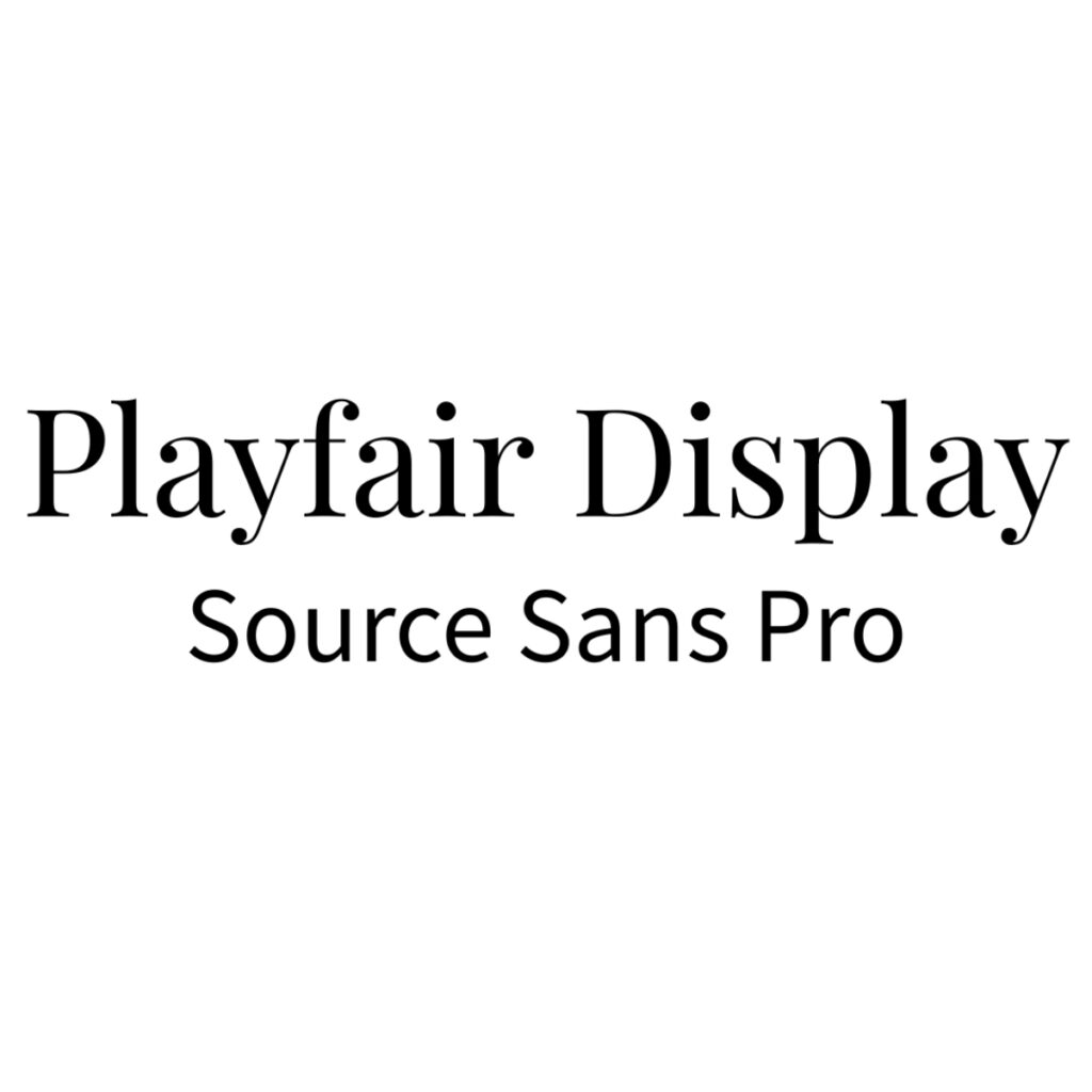
Playfair Display + Source Sans Pro
Personality: Sophisticated but approachable
Best for: Executive coaches, business strategists, high-end consultants
Why it works: Playfair’s elegant serifs command authority for headlines, while Source Sans Pro keeps body copy clean and readable.
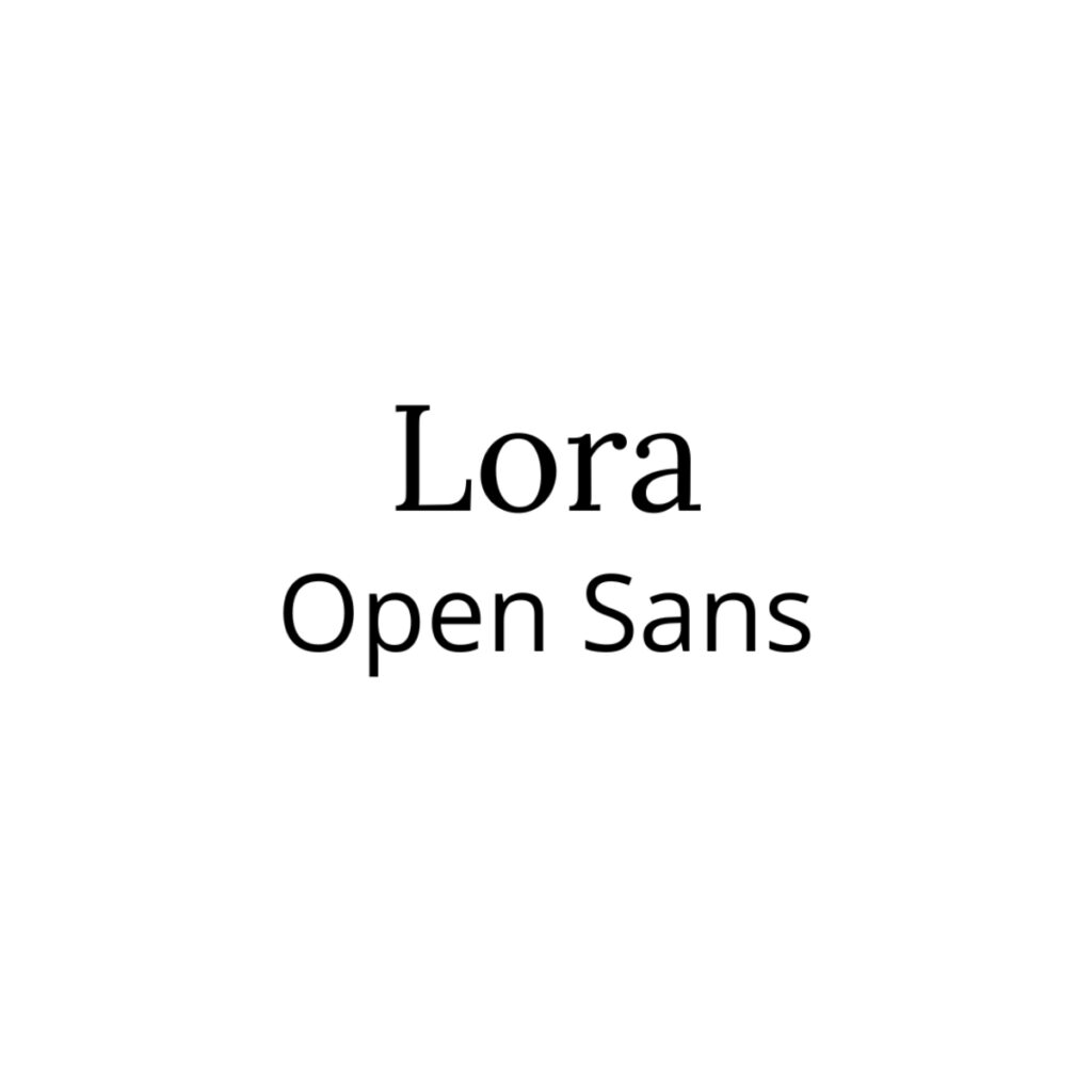
Lora + Open Sans
Personality: Trustworthy and modern
Best for: Life coaches, career coaches, relationship coaches
Why it works: Lora has personality without being flashy, and Open Sans is one of the most readable fonts ever created.
Merriweather + Lato
Personality: Established expertise with contemporary edge
Best for: Financial coaches, leadership coaches, professional development
Why it works: Merriweather was specifically designed for screen reading, while Lato feels professional but not stuffy.

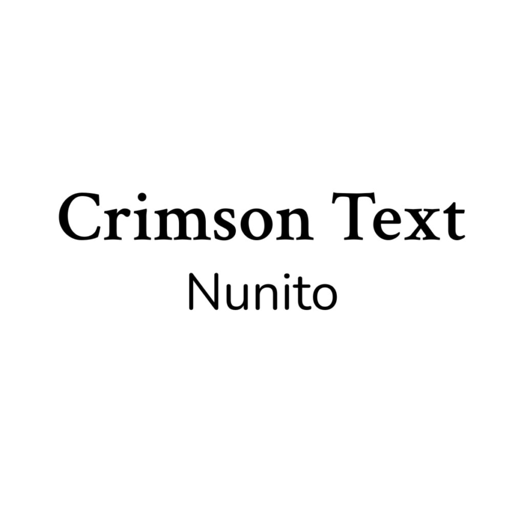
Crimson Text + Nunito Sans
Personality: Academic authority meets friendly accessibility
Best for: Mindset coaches, therapy-adjacent coaches, educational content creators
Why it works: Crimson Text has bookish credibility, while Nunito Sans keeps things conversational.
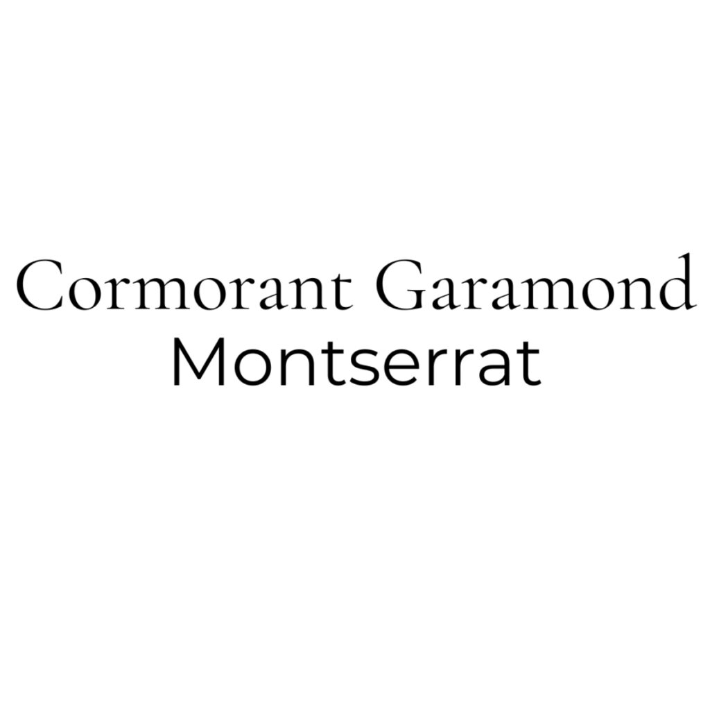
Cormorant Garamond + Montserrat
Personality: Luxury meets efficiency
Best for: High-ticket coaches, transformation specialists, premium services
Why it works: Cormorant has that expensive feel for headlines, while Montserrat is clean enough for any body copy.
Each of these combinations gives you everything you need: one font for headlines and attention-grabbing elements, one font for body copy and supporting text.
Font Hierarchy That Converts: Headlines, Subheads, and Body Copy
Now that you’ve chosen your two fonts, here’s how to implement them strategically:
Main Headlines (Your Primary Font)
This is your main message—the first thing visitors see. Use your more distinctive font here, sized large enough to grab attention even on mobile. Whether that’s your serif or sans-serif depends on your brand personality.
Subheads (Your Secondary Font)
Here’s where the magic happens. Use your secondary font, often in all caps, to create clear content sections. This creates rhythm and makes your content scannable—crucial for busy coaches and their even busier potential clients.
Body Copy (Your Secondary Font)
All your paragraphs, lists, and longer explanations should use your more readable font. This is usually your sans-serif, but not always. The key is consistency and readability across devices.
Accent Text and Quotes
Pull quotes, testimonials, and special callouts can use either font, but stick to your system. Mixing fonts randomly breaks the pattern you’re working to establish.
Font Licensing: Why Google Fonts Are Perfect for Beginners
Here’s something most design tutorials skip: font licensing matters. There are different licenses for different uses and also different licenses for using fonts on your website vs your marketing materials. Your font license cost might also depend on how many visitors you get to your website.
Google Fonts solve this problem completely. Every font in their library is:
- Free to use for any purpose, including commercial
- Web-optimized for fast loading
- Legally cleared so you never have to worry about licensing issues
- Professionally designed by actual typographers
Once you’re generating consistent revenue and want something more unique, you can explore premium options. Jenn Wagner creates beautiful fonts specifically for entrepreneurs, and investing in distinctive typography can be worth it at higher business levels.
But when you’re starting out? Google Fonts give you everything you need to look professional without the legal complexity or ongoing costs.
Common Font Mistakes That Kill Your Credibility
Even with the 2-font rule, coaches still make these credibility-killing mistakes:
Using Default System Fonts
Arial and Times New Roman scream “I didn’t put effort into my brand.” Your potential clients notice, even if they can’t articulate why your marketing feels generic.
Choosing Fonts That Don’t Match Your Brand Personality
A playful script font might work for a creativity coach but will confuse potential clients of a financial planning coach. Your typography should support your message, not contradict it.
Poor Font Size Hierarchy
If your headlines are only slightly bigger than your body text, you’re missing opportunities to guide your reader’s attention. Create clear size distinctions between your font levels.
Mixing Too Many Font Weights
Just because your font family has 12 different weights doesn’t mean you should use them all. Stick to 2-3 weights maximum: regular for body copy, bold for emphasis, and maybe light for captions.
Ignoring Mobile Readability
Your fonts might look gorgeous on your laptop, but can your ideal client read them on their phone while waiting in line at Starbucks? Test everything on mobile—that’s where most of your traffic lives.
Free Resources to Get Your Brand Fonts Right
Typography can feel overwhelming when you’re building a coaching business. You’re already juggling client work, content creation, and business development. The last thing you need is another design decision keeping you up at night.
That’s exactly why I created resources that handle the font strategy for you:
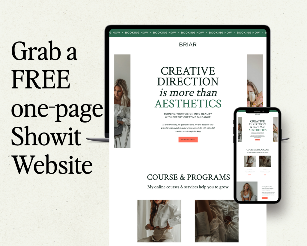
Free Website Template
Skip the guesswork with a professionally designed one page template that already has the 2-font rule implemented perfectly. The typography hierarchy is built in, so you can focus on your content instead of design decisions.


")

")

