
resize")
")
")
")


")
")


Project Overview
Client: Mara Signal, Business Coach for Fractional Leaders
Project Scope: Brand identity and website design for an established business coach evolving from 1:1 consulting into a scalable group-based offer.
This project was designed around a very specific emotional moment: the point after success, when the celebration quiets and clarity becomes more valuable than momentum.
Mara works with fractional leaders, consultants, and strategists who are already operating at a high level. They’re experienced, respected, and earning well. But their income is still closely tied to their time, and they’re starting to feel the limits of that model. They’re ready for the next evolution: scaling delivery without diluting quality or burning out.
This isn’t an audience looking for motivation or quick wins. These are established business owners who value thoughtful strategy over hacks, sustainable growth over constant launches, and being taken seriously. The website needed to reflect that maturity while still feeling energizing and forward-moving.
The Challenge
Mara’s business was at a critical stage of growth. She was shifting from primarily 1:1 consulting to leading with a signature group program, The Scale Method. That shift created a tension the website needed to resolve.
Her site needed to create a sense of momentum without relying on urgency tactics or performative marketing. It had to honor past wins while making it clear there was more available.
The challenge was precision.
We needed to signal expertise without feeling corporate or cold.
We wanted to invite growth without pressure.
And it was important to acknowledge success without anchoring potential clients to it.
These goals shaped every decision that followed.
Understanding the Audience
Mara works with service-based business owners who have been in business for several years and are already earning multiple six figures. Many operate as consultants, strategists, or fractional leaders. They’re fully booked or close to it, but their income is still tied directly to their hours.
They aren’t looking for someone to teach them how to get clients. They already have demand. What they’re looking for is support in restructuring how they work so growth doesn’t automatically mean more effort or less capacity.
That understanding became the filter for every design and messaging decision.
Strategic Approach
Rather than presenting multiple equal options and hoping visitors would choose, the site was designed around a single, clear path. The structure acknowledges where the audience has been, then quietly guides them toward what comes next.
The core insight guiding the work was: this brand needed to recognize success without getting stuck in it. The language and visuals needed to say, you’ve already done hard things while also saying, there’s a more sustainable way forward.
Design Direction: After the Confetti Settles
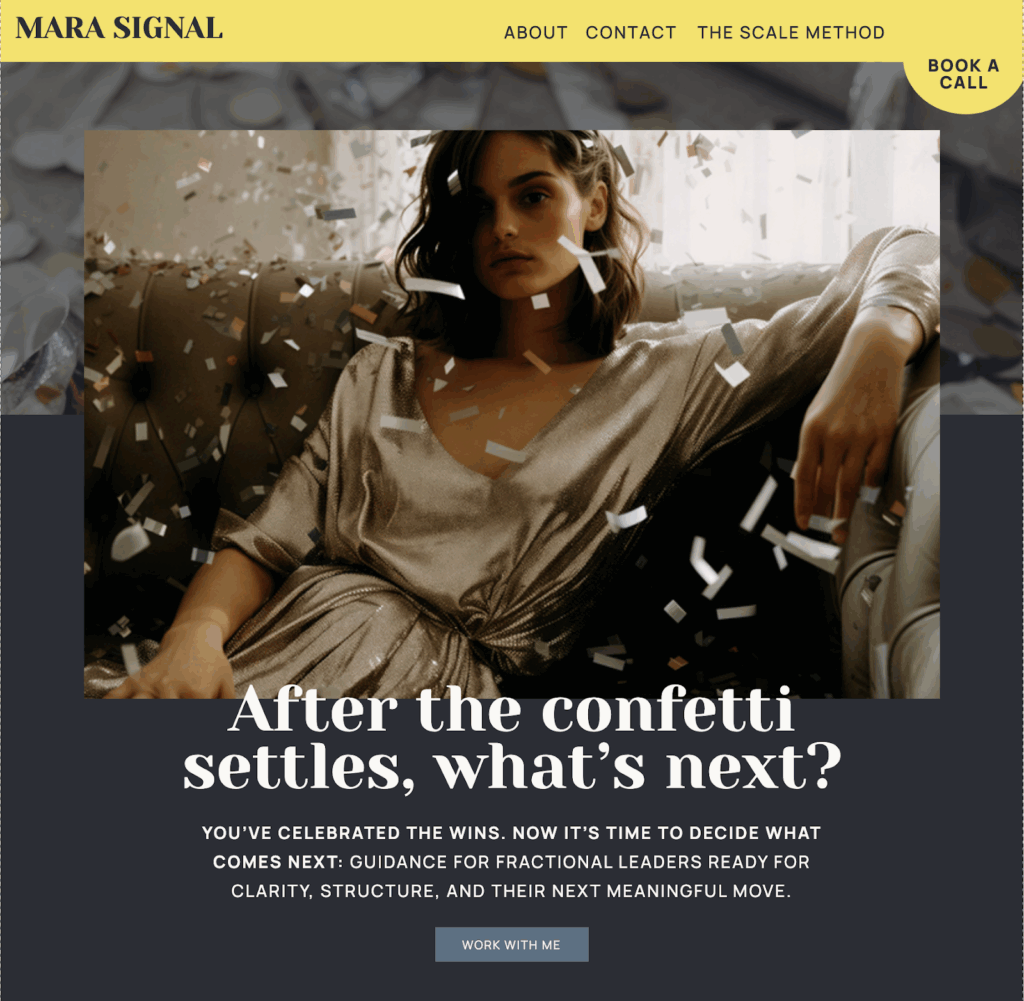
The phrase “after the confetti settles” became the conceptual anchor for the homepage. It captured the emotional state of Mara’s audience perfectly: celebration followed by recalibration. Wins followed by intention.
From that idea, the visual system began to take shape.
Custom Confetti Elements
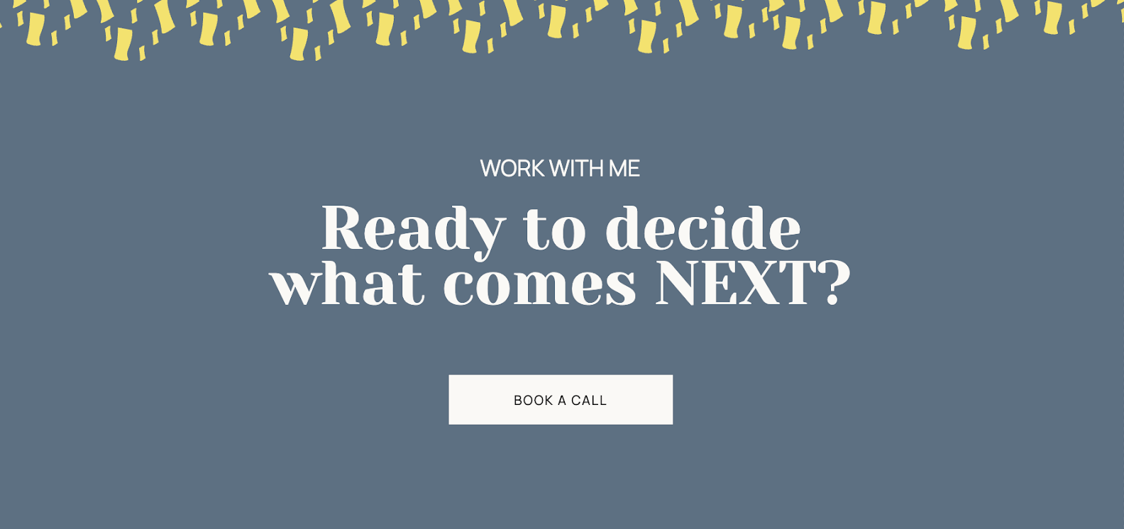
Mara had incorporated confetti into her brand photography, which gave us a solid starting point. I developed a custom illustrated confetti system in Adobe Illustrator that could be used sparingly and strategically throughout the site.
Confetti appears at moments of transition, places where visitors are asked to pause, reflect, or decide what comes next. It’s never decorative for its own sake. Instead, it reinforces the idea that celebration and strategy aren’t opposites. You can honor what you’ve built and still move forward deliberately
Color Palette: Bold, Multi-Dimensional, Strategic

Color played a functional role in this project, not just an aesthetic one. Instead of relying on a single neutral background, the site uses a rotating background system to create visual rhythm and momentum as visitors scroll.
Muted slate blue grounds reflective sections and supports clarity. Deep charcoal adds weight and authority. Soft sage green introduces perspective and growth. Warm tan brings approachability and balance.
Each background shift creates a natural pause, guiding the eye and reducing cognitive load for visitors who are already making complex decisions all day.
Butter chartreuse yellow functions as the site’s signal. It appears in directional moments like navigation, calls to action, geometric frames, corner details, and highlights, drawing attention toward movement and decision-making rather than acting as background color.
Small, intentional red accents add warmth and prevent the palette from feeling overly cool or corporate. Used sparingly, they introduce energy without disrupting the overall tone.
As you scroll, you move through emotional states: reflection, depth, growth, grounding with moments of “this matters” punctuated by yellow. The palette mirrors the journey the audience is already on.
Geometric Shape System: Structure Meets Movement
A consistent geometric shape system reinforces the emotional progression of the site.
Squares create structure and containment. Circles introduce pause and humanity. Corner triangles suggest direction and forward motion. These shapes repeat throughout the site in frames, borders, and section dividers, creating rhythm without visual noise.
Typography: Authority with Warmth
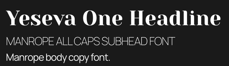
The type system balances confidence and approachability.
Yeseva One anchors headlines with calm authority. It feels established without being ornamental. Manrope supports body copy and subheadings with clarity and warmth, designed for ease and readability.
Together, the typography communicates serious work delivered thoughtfully.
Copywriting Strategy: Signal and Next
Mara came into the project with a strong point of view and a clear sense of her work. She gave me the opportunity to use my copywriting to help refine and systematize her existing copy.
Her last name, Signal, naturally aligned with her role: helping clients cut through noise and make clear, grounded decisions. We began weaving language around “signal” and “next” throughout the site as a quiet throughline.
Calls to action, section transitions, and headlines reinforce a single idea: clarity is the advantage, and the next move matters.
Building the User Journey
The site structure is intentionally restrained: Home, About, Work With Me, The Scale Method, and Contact.
The homepage is designed to qualify visitors immediately. The hero establishes who Mara serves and filters out the wrong audience within seconds. The value proposition reinforces sustainable scaling over hustle culture. Social proof comes from established business owners, not early-stage wins.
The message is consistent throughout: if you’re already successful and ready to work differently, you’re in the right place.
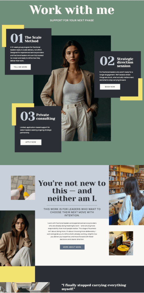
Work With Me: Hierarchy Without Overwhelm
The services page was designed to make decision-making easier.
The Scale Method leads the page, both visually and conceptually. It’s positioned as the natural next step for leaders ready to shift out of 1:1 delivery. For those who aren’t there yet, a Strategic Direction Session offers a focused way to work together one-on-one. Private consulting remains available, but intentionally understated and application-based.
The result is a page where nothing competes for attention. Each offer has a role, and the structure supports Mara’s move toward a more scalable model without minimizing the depth of her expertise.
About Page: Credibility with Humanity
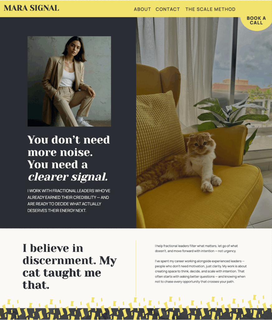
The About page balances authority with approachability.
The hero features Mara and her cat, Jonesy, a subtle nod to discernment, intuition, and choosing carefully. Traits that show up not just in her personality, but in how she works with clients.
We avoided just listing credentials, the page focuses on how she thinks and makes decisions. A lighthearted “A few things you should probably know” section adds personality without undermining expertise, reinforcing the idea that fit matters and that working together is a relationship, not a transaction.
Intersection of copy, strategy, and design.
The site filters, guides, and creates space for the right people to recognize themselves before being asked to act. It honors where clients have been while making it clear there’s a path forward.
Mara’s site reflects a business that has grown up and a designer who understands how businesses actually grow.


")

")

