

")
")
")
")


A brand transformation about giving growth the structure it deserves.
Avery Linden’s business was growing. Referrals were steady. Her clients were seeing meaningful results. Word-of-mouth carried real weight in her growth.
But her website was not pulling its weight.
It functioned like a brochure frozen in time. It was warm, thoughtful, and informative, but not strategic. It explained her philosophy. It listed her services. It reflected her values. What it did not do was guide a decision. And when a website does not guide, it creates friction.
This project was about giving her existing momentum the structural clarity it needed to move forward.
BEFORE
The Context
Avery is a functional nutrition and metabolic health coach who helps women stabilize their energy, balance blood sugar, and rebuild trust with their bodies. Her approach is systems-based and deliberately non-restrictive which is a meaningful differentiation point in an industry saturated with extremes, quick fixes, and unsustainable protocols.
That clarity, however, was not visible on her website. The information was accurate and her philosophy was sound but it wasn’t prioritized in a way that allowed visitors to make a decision.
Her site had heart. It had knowledge. It had intention. What it lacked was structure. And structure is what converts.
Where the Friction Lived
BEFORE
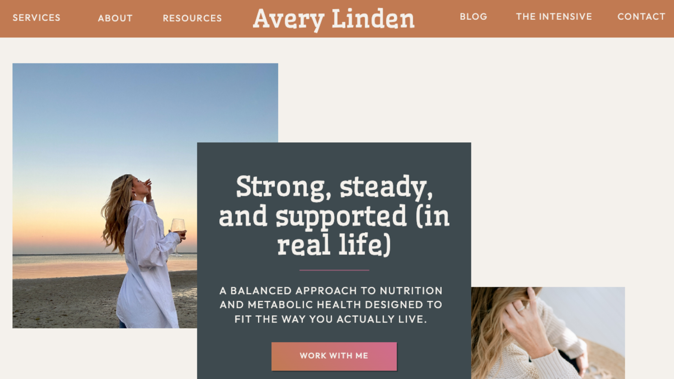
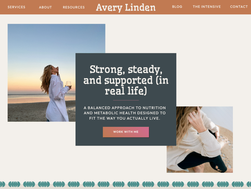
The original homepage opened with a long, outcome-neutral headline. Multiple calls to action carried equal visual weight. There was no immediate sense of who the site was for or what changed after working with Avery. Everything was competing so nothing was leading.
Further down the page, dense blocks of educational copy explained metabolic health, restrictive dieting, and whole-body balance in thoughtful detail. The information was solid. The philosophy was sound. But visitors left understanding what Avery believed, not necessarily whether they were in the right place.
Knowledge builds trust. Clarity builds movement.
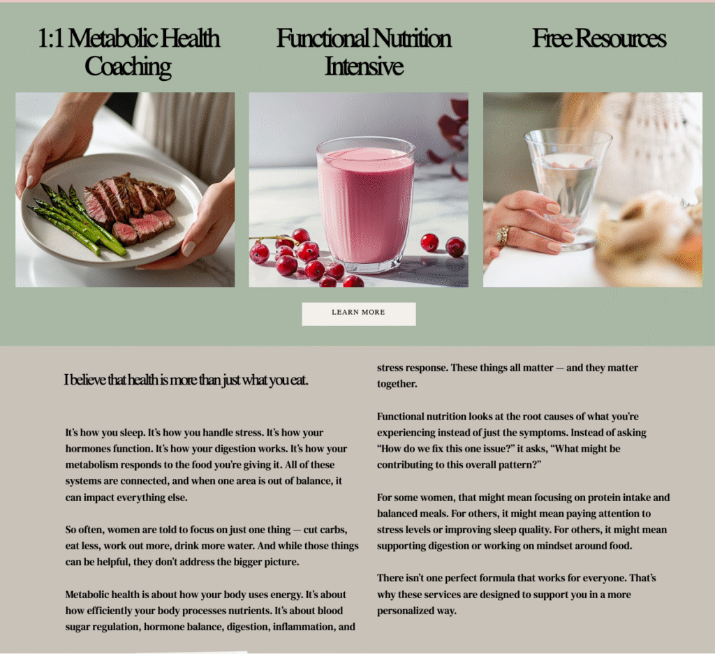
Her services were listed: 1:1 Coaching, Functional Nutrition Intensive, Free Resources…but without differentiation or sequencing. There was no clear entry point. No progression. No signal for where someone should begin. Visitors were given options, but not direction.
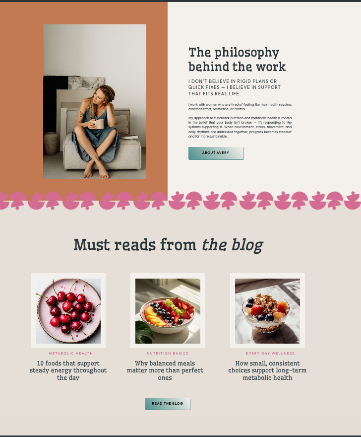
Long paragraphs increased cognitive load. The About section appeared before a clear value proposition. Educational sections required sustained reading before a visitor could determine if the site was relevant to them. The experience asked too much, too soon.
And then there was the visual layer.
The Hidden Misalignment
The brand leaned heavily into green. Not because Avery loved it (she very much did not) but because she believed a wellness brand needed green to be taken seriously.
In a saturated category, green signals familiarity. It positions you inside the wellness template rather than apart from it. For a practitioner whose entire philosophy rejected industry clichés and one whose approach was grounded, systems-based, and deliberately anti-extreme, visual conformity quietly undermined that positioning.
Avery’s philosophy rejected wellness tropes. Her visuals quietly reinforced them.
When a brand adopts signifiers that do not align with its core identity, the misalignment shows up emotionally before it shows up rationally. Visitors may not consciously register the disconnect, but they feel it. That feeling matters…especially for clients seeking a thoughtful, non-prescriptive approach to health.
The brand was performing wellness instead of expressing identity. Part of this project became about giving Avery permission to stop performing what a wellness brand should look like and start building what this wellness brand actually was.
The Diagnosis
The site lacked prioritization.
There was no controlled flow of attention. No intentional sequencing. No visible hierarchy guiding the experience. Avery’s authority existed in her content but it just was not reinforced in the structure.
Before redesigning, we clarified one core question: What is this website actually for?
A website has one job: reduce friction. It should clarify who it is for, articulate what changes, establish authority through hierarchy, create a primary path, and lower cognitive load. Anything that does not support those goals (even if it is accurate or heartfelt) becomes noise.
The redesign was not about adding more. It was about making deliberate decisions.
The Strategic Shift
Messaging That Filters
We shifted the messaging from philosophy-driven to transformation-driven. The hero headline moved from explaining metabolic health to naming who it was for and what changed. The language filtered immediately: women seeking sustainable energy and hormonal balance without extreme diets knew within seconds whether they were in the right place.
The value proposition was reorganized around three connected pillars: Metabolism, Nutrition, and Balance, allowing visitors to quickly orient themselves without wading through dense explanations. Each pillar included a custom supporting icon and brief description, creating visual rhythm and making the information scannable.
Structure That Guides
The About section was reframed. Instead of leading with Avery’s personal journey, it opened with I work with women who… The shift from personal credibility to client-centered authority made the section feel relevant instead of indulgent. Her story still mattered but it just supported her positioning rather than replacing it.
Her offers were reorganized into a clear progression: a Functional Nutrition Assessment as an accessible entry point, 1:1 Metabolic Coaching as the core signature program, and additional resources and guides as a way into her world. Each offer now had a defined role. The structure guided instead of asking visitors to self-sort.
We also reworked the testimonial sections to anchor specific outcomes rather than general praise. Avery had a library of testimonials she hadn’t gotten around to adding to her website. We went through and pulled out the strongest lines to feature and show the impact of her work.
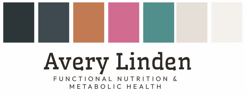
Visual Identity That Aligns
Typographically, we introduced a clear system. Wellfleet brought grounded humanity to headlines. It was slightly unconventional without being quirky. Outfit handled body copy and interface elements with warmth and readability. The pairing created a balance between approachability and authority.
Visually, we retired the green-heavy palette and introduced warm, grounded tones like terracotta and soft coral. Muted earth tones that better reflected Avery’s philosophy of sustainability and balance.
The palette did not just look different. It felt different. It signaled thoughtful deviation from wellness norms rather than compliance with them. That emotional shift mattered because it reinforced Avery’s positioning as someone who thinks independently about health, not someone following industry scripts.
The brand stopped performing wellness and started expressing identity.
The Transformation
Before, the site was sincere and educational. It functioned as an online brochure. It was reflective of Avery’s values, but passive.
After, the site is directional.
It names the audience immediately. It clarifies the transformation. It reduces cognitive load. It differentiates offers. It aligns visual identity with philosophy. The change is not dramatic in isolation. It is decisive in structure.
The site now filters the right audience in within seconds. It positions Avery as the guide, not just the knowledgeable practitioner. It creates a clear client journey from awareness to decision. It makes navigation intuitive rather than effortful.
Avery’s business was already strong. Now her website reinforces that strength instead of slowing it down.
What Makes a Strong Website
Strong websites do not just communicate. They prioritize. They filter. They guide. They make it easy for the right person to recognize themselves and take the next step.
This project was about giving Avery’s business growth a structure that could support it. It was about diagnosing where friction lived, not just visually, but strategically, and resolving it through intentional hierarchy, clear messaging, and aligned identity.
Education is not the same as positioning. Knowledge builds trust, but clarity builds movement. Your homepage should answer who you are for and what changes before it explains how you work.
Conformity undermines differentiation. Following industry visual norms may feel safer, but it positions you as interchangeable. When your visual identity does not align with your actual philosophy, the disconnect shows up emotionally…even if visitors cannot articulate why.
Hierarchy is strategy made visible. Clear visual hierarchy is about guiding attention and reducing cognitive load. When everything has equal weight, visitors experience decision fatigue before they experience clarity.
When strategy leads, design stops being decorative and starts being directional.
The Path Forward
This project came together at the intersection of messaging, structure, and identity. The site now filters, guides, and creates space for the right people to recognize themselves before being asked to act. It honors where Avery has been while making it clear there is a path forward. The website reflects a business that has matured and a designer who understands how businesses actually grow.


")

")

