

")
")
")
")


Project Overview
Client: Claire Morgan, Life Coach
Project Scope: A repositioning project for an established life coach whose practice had outgrown her online presence.
Claire came to me with something I see often: a successful coaching practice that had outgrown its online presence. She’d been in business for years, had established trust with her clients, and was doing some really impactful work…but her website didn’t reflect any of that. It felt polished in a way that created distance where she really needed connection. It explained what she did without evoking how it actually felt to work with her.
This website project was about creating a digital experience that matched the depth and humanity of Claire’s coaching: a place where visitors could feel seen before they ever booked a call.
The Challenge
Claire works with women navigating seasons of change. Claire’s clients are women who look “fine” on the outside but feel disconnected or dulled internally. They’re asking reflective questions like “Is this really my life?” and “What happened to my curiosity or sense of aliveness?”
Her existing website leaned instructional. It told visitors about her process, her credentials, her methodology, but it didn’t create the emotional connection her work requires. The site was doing its job functionally, but it wasn’t building trust or inviting the kind of reflection her ideal clients needed to feel before taking action.
Claire wanted fewer inquiries and better-aligned clients. She wanted a site that felt human, spacious, and calm. She wanted language rooted in emotional nuance and she wanted a brand that honored depth, slowness, and intentional living.
Understanding the Audience
Before making any design decisions, we needed to get clear on who we were speaking to and what they were experiencing.
Claire’s ideal clients are women who:
- Are experiencing identity shifts, life transitions, or a loss of meaning
- Feel flat even when everything is technically okay
- Want to feel more present, awake, and connected to themselves again
They’re not looking for someone to fix them. They’re looking for someone to help them come back to themselves.
This direction shaped everything from the color palette to the way we structured the user journey.
Strategic Approach
This project required three things working together: copy, design, and user experience. Not as separate elements, but as a system.
As someone with a copywriting and marketing background, I don’t approach design as decoration. I approach it as a way to guide people clearly from point A to point B. That means every section needs a purpose. Every headline needs to do work. And every visual choice needs to support the emotional experience we’re trying to create.
For Claire, that emotional experience was:
- A deep exhale
- A pause
- A reminder that there’s more available than just “getting through the days”
We weren’t trying to convince anyone of anything. We were trying to create space for them to recognize themselves.
Design Direction
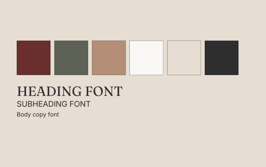
Color Palette
Claire’s love of burgundy became the anchor for the entire palette. But we went beyond picking colors that looked good together. We chose colors that reinforced the emotional tone of the work.
Deep Burgundy (#6b2e2e) became the decision-making color. It anchors CTAs and key moments where we’re asking visitors to take action—like booking a call or exploring the Clarity Crew sales page.
Muted Olive Green (#5f6256) and Warm Clay (#b58e78) introduce grounded warmth without feeling overly earthy or “wellness-y.” These colors support the sense of calm and reflection without leaning into tired coaching tropes.
Soft Off-White (#faf9f7) and Soft Linen (#e6ddd3) dominate the backgrounds, giving the site the spaciousness it needed. We didn’t want the design to feel heavy or cluttered. The content needed room to breathe.
Charcoal Black (#2f2f2f) keeps the typography crisp and readable without harsh contrast.
The overall strategy: neutrals dominate to support calm and reflection. Color is used intentionally, not decoratively.
Typography
Typography is one of the most underutilized tools in web design. People think it’s about picking a pretty font, but it’s actually about hierarchy, readability, and emotional tone.
For Claire, we paired Fraunces (a warm, editorial serif) with Inter (a clean, neutral sans-serif).
Fraunces handles the headlines and key emotional statements. It adds warmth and depth without feeling decorative or overly poetic. It supports reflection and presence while maintaining authority.
Inter grounds everything. It’s used for body copy, descriptions, and supporting text, providing clarity and legibility so the site doesn’t become too expressive.
The result: a type system that feels sophisticated and human at the same time.
Building the User Journey
The website structure is intentionally simple: Home, About, Work With Me, Clarity Crew (sales page), and Contact.
Each page answers one clear question: What kind of business is this, and what decision should the visitor feel gently guided toward?
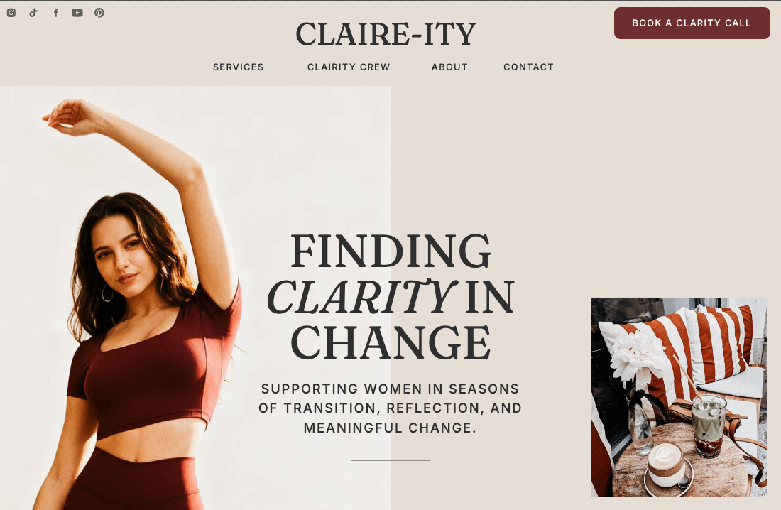
Homepage: Building Trust Before Asking for Anything
The homepage follows a clear progression:
Hero section establishes who Claire is and who she serves. The headline is short, clear, and emotionally resonant.
Value proposition reinforces what makes her approach different without listing credentials or explaining methodology. This section focuses on how her clients feel, not what her process looks like.
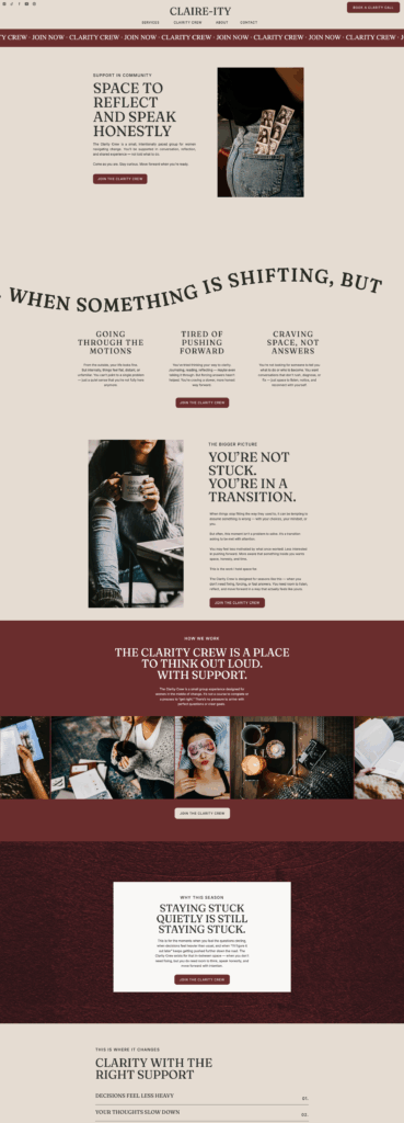
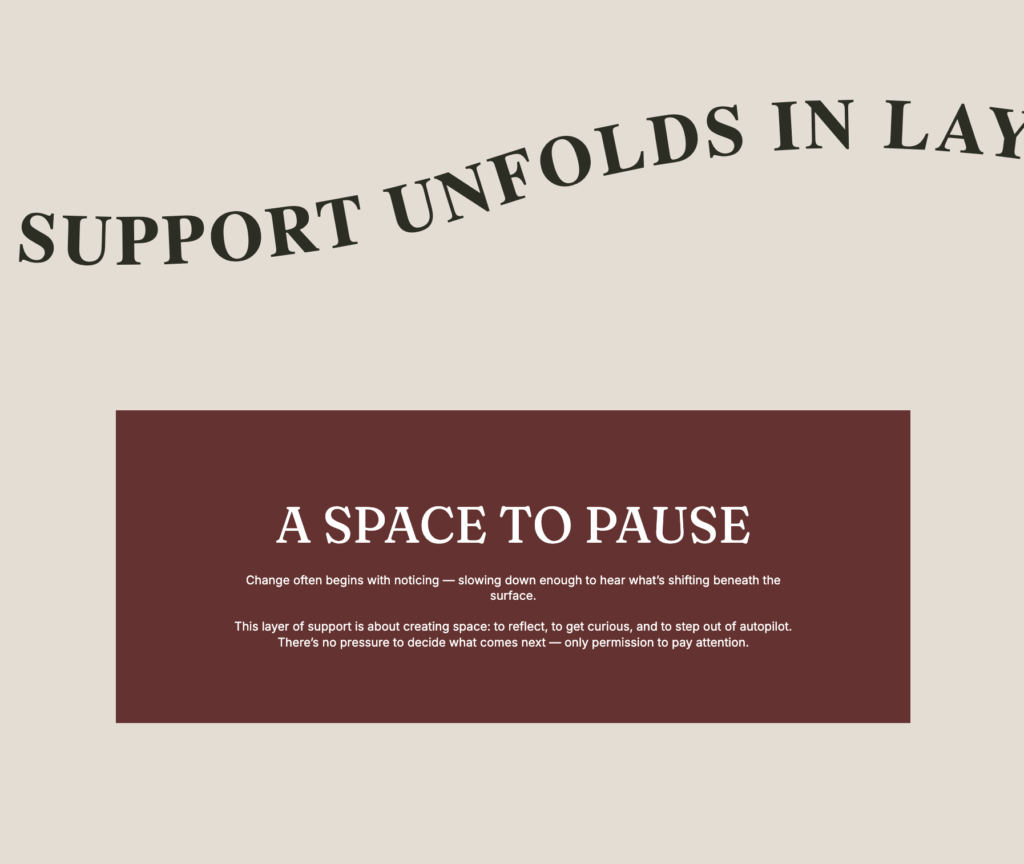
Her approach: “Support in Layers”
This is where my copywriting background really came into play. Claire originally described her work in more linear terms, but the idea of layered support felt truer to how coaching actually works. It’s not a step-by-step system. It’s multidimensional.
We created a section with the headline “Support in Layers” that repeats across the page like a banner. Beneath it, three colored boxes stack on top of each other as you scroll:
- A Space to Pause (burgundy)
- Room to Explore What’s Changing (olive green)
- Moving Forward with Intention (charcoal)
Each box describes a different dimension of Claire’s support. As you scroll, the next box literally layers on top of the previous one—reinforcing the concept visually and experientially.
This wasn’t just a design choice. It was a strategic decision to show rather than tell.
Lead magnet section offers a free mini-course on how to navigate change. This gives visitors a low-commitment way to engage with Claire’s work before booking a call.
Clear, consistent CTAs guide visitors toward booking a call: the primary goal of the site. Where it made sense, we used “Book a Call” as the button copy throughout. When linking to other pages (About, Services, the Clarity Crew sales page), the language shifted to match context but we kept the primary action clear.
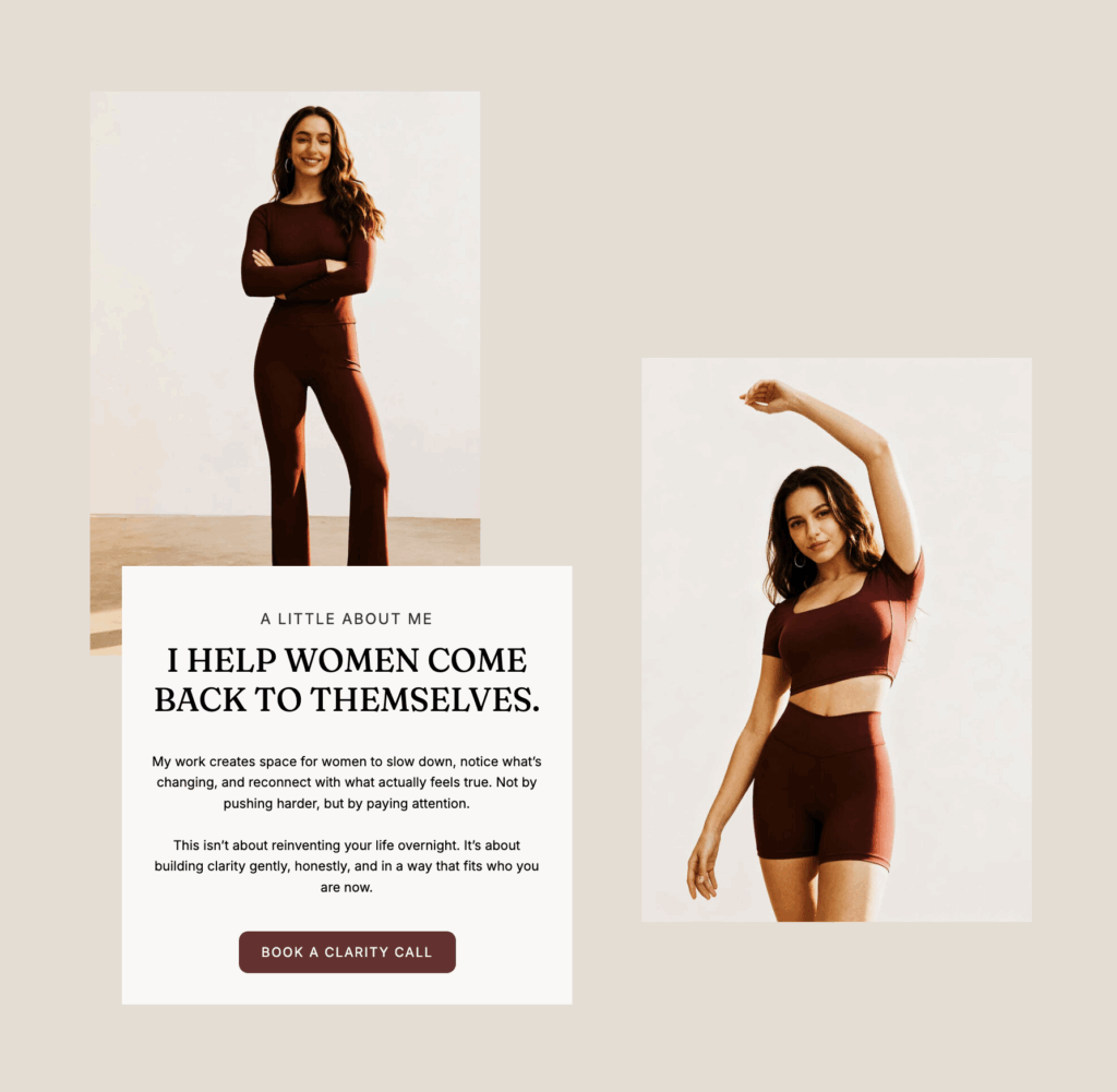
About Page: Depth Without Distance
The About page reinforces Claire’s experience and perspective without falling into the trap of listing credentials. It focuses on why she does this work and who she is as a guide, not just what she’s certified in.
Work With Me Page: Clarity Over Options
This page outlines Claire’s offerings without overwhelming visitors with too many choices.
The Clarity Crew (her signature group program) is positioned as the primary pathway. It’s emphasized throughout the site and supported by a dedicated sales page.
1:1 coaching (3-month and 6-month containers) is presented as deeper, more immersive support.
This strategic choice reinforces community over urgency and process over prescriptions.
Clarity Crew Sales Page: An Invitation
The sales page for Claire’s group program follows the same principles as the rest of the site: emotional resonance before explanation. It walks visitors through what the program offers, who it’s for, and how it works.
The page answers the questions potential clients are really asking: Will this actually help me? Will I feel supported? Is this the right time?
Copy Refinements That Made a Difference
One of the biggest shifts in this project was tightening up the language to be short but clear. Claire’s original messaging was thoughtful but verbose. We refined headlines to be more direct without losing emotional depth.
For example:
- Instead of “I help women who are navigating big life transitions find clarity and reconnect with themselves,” we landed on something like “For Women in a Season of Change.”
The “Support in Layers” section was another key refinement. The original concept was there, but the language didn’t quite capture it. By distilling each layer into a clear headline that moves across the page, we made the idea both visually compelling and strategically sound.
We also standardized button copy across the site. Inconsistent CTAs create friction. When the goal is to book a clarity call, the language should reflect that consistently, unless context requires something different (like “Explore the Clarity Crew” when linking to the sales page).
Copy + Design + Strategy = A System
This is a life-centered, soul-aware, modern coaching presence.
The work showcases:
- Designing for emotional depth without drama. The site feels calm and grounded, not overly stylized or performative.
- Sophistication without coldness. The design is refined, but it’s still warm and human.
- Authority rooted in presence rather than credentials. Claire’s expertise comes through in how the site feels, not in how many certifications are listed.
- Strategic restraint and intentional hierarchy. Every section has a purpose. Every visual choice supports the user journey.
Most importantly, it demonstrates how copy, design, and strategy work together as a system. You can’t create a website that truly works by focusing on just one of those elements. They have to be integrated from the beginning.
Creating Space
Claire’s website doesn’t try to convince anyone to work with her. It creates space for the right people to recognize themselves and then gives them a clear, gentle path forward.
That’s what strategic design is supposed to do. Not impress. Not overwhelm. Just guide people clearly toward what they’re already looking for.
This project reminded me why I love this work. It’s not about making things look pretty. It’s about creating clarity, building trust, and supporting businesses in showing up the way they actually are, not the way they think they’re supposed to be.


")

")
")

")