Project Overview
Client: Grounded Wealth with Ingrid Vale, Money Coach
Project Scope: Brand identity system and website design for a money coaching practice centered on emotional regulation, systems-based behavior change, and sustainable financial decision-making.
This project was designed around the catalyst moment for Ingrid’s business. It’s the story woven into everything she does and we knew it had to be part of her branding. The moment she was standing barefoot on the beach at sunset, broke and frustrated, and deciding that she was going to take control of her financial wellbeing and change her story. That visual and emotional anchor (sunset warmth, grounding, regulation before resolution) became the foundation for everything that followed.
Ingrid works with women who are tired of feeling reactive, overwhelmed, or uncertain about money. Her clients aren’t looking for quick fixes or motivational content. They’re looking for clarity, systems, and support that feels sustainable. The website needed to reflect that maturity and steadiness while still feeling dynamic and inviting.
The Challenge
Ingrid’s brand identity was rooted in that powerful visual moment: sunset at the beach, warmth, grounding, presence. Her brand photography leaned heavily into these sunset tones, which created both an opportunity and a challenge.
The opportunity: a cohesive, emotionally resonant visual identity.
The challenge: making sure the site didn’t feel static, one-note, or so visually saturated that the messaging got lost.
Because her brand was wrapped in warmth and sunset imagery, the copy has to do the heavy lifting. Visitors needed to immediately understand: she is a money coach. Not lifestyle or wellness in the abstract.
The site also needed to feel alive. A sunset isn’t stagnant. It shifts, it moves, it combines color in ways that feel dynamic. The design needed to reflect that without becoming chaotic or overwhelming.
Understanding the Audience
Ingrid’s clients are women who are already capable and successful in other areas of their lives, but their relationship with money feels chaotic, reactive, or uncertain. They’re not looking for someone to tell them to budget harder or hustle more. They’re looking for steadiness. Systems. Emotional regulation. A more sustainable way forward.
These are people who value thoughtful guidance over hype, behavior change over quick wins, and being taken seriously. The website needed to signal: this work is grounded, not performative.
Strategic Approach
The strategic approach centered on three priorities:
1. Let the copy lead. With such a strong visual identity, the messaging needed to be crystal clear about what Ingrid does and who she serves. No metaphors without function. No warmth without clarity.
2. Build journeys, not just layouts. Each section needed to guide visitors deliberately through recognition, understanding, and action. The site structure reflects how people actually make decisions when they’re already overwhelmed.
3. Keep the palette alive. Use color shifts to create natural pauses, guide the eye, and prevent the site from feeling flat or monotonous.
Design Direction: Sunset as Catalyst, Not Theme
The sunset was the catalyst moment for Ingrid’s entire approach. Standing at the beach, barefoot in the sand, water at her ankles, broke and frustrated but finding steadiness in that pause. That moment of regulation before resolution became the emotional core of the brand.
The brand photography leaned into this: sunset tones, beach settings, warmth. Our job was to extend that visual language into the website in a way that felt dynamic and intentional, not decorative.
Color Palette: Movement Through Warmth
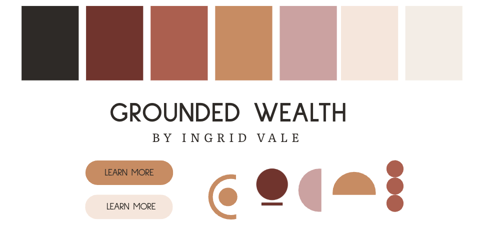
The palette was built around the sunset editorial concept. L ate afternoon light, warmth without cheerfulness, steadiness without coldness, emotional intelligence without softness.
Cream (#F4EEE6): Warm, sunlit, grounding.
Warm Charcoal (#2F2A26): Primary text. Softer than black, more human.
Blush Clay (#D3A1A1): Muted pink with weight. Emotional but grounded.
Burnt Apricot (#D28A5C): Warm orange with restraint.
Soft Rust (#B85A4A): Orange-red crossover. Adds seriousness and depth to key moments.
Oxide Red (#7A2F2A): Deep, earthy red for emphasis and anchoring.
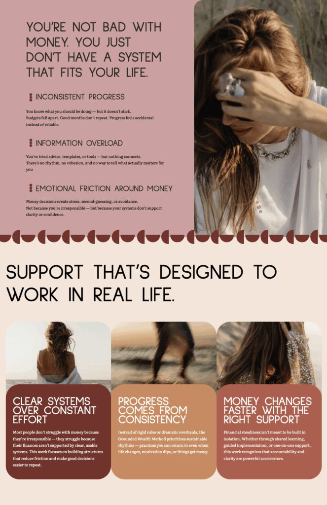
Rather than sticking to a single neutral background, sections rotate through the palette. Each shift creates a natural pause, guides the eye, and reduces cognitive load. The palette mirrors movement: reflection, warmth, grounding, depth.
This approach kept the site from feeling static. A sunset isn’t one color. It’s a progression and the palette reflects that.
Custom Icon System: Grounding and Wholeness
To elevate the design without adding visual noise, I created a custom minimalist icon system in Adobe Illustrator. The icons are built from simple geometric forms: circles, half-circles, pieces of the whole coming together in different configurations.
The visual language reinforces the brand’s core ideas: grounding, wholeness, systems, and connection. These icons appear throughout the site in moments of transition and emphasis, subtle enough to support the content without competing with it.
Typography: Calm Authority
The type system balances warmth and authority.
Sulphur Point anchors headlines and navigation with soft geometry and modern restraint. It feels warm, stable, and human without being playful or trendy.
Literata supports body copy with clarity and intelligence. Designed for long-form reading, it has warmth without romance and authority without tradition.
Together, the typography communicates: this is serious work delivered thoughtfully.
Copywriting Strategy: Clarity Without Metaphor
When your visual identity is saturated with sunset warmth and beach imagery, the copy needs to do the heavy lifting. Visitors can’t be left guessing what you actually do.
I worked with Ingrid’s existing copy to refine headlines, smooth transitions, and integrate her language more consistently. The goal was to make sure every section clearly communicated: this is money coaching. Systems-based. Grounded in behavior change.
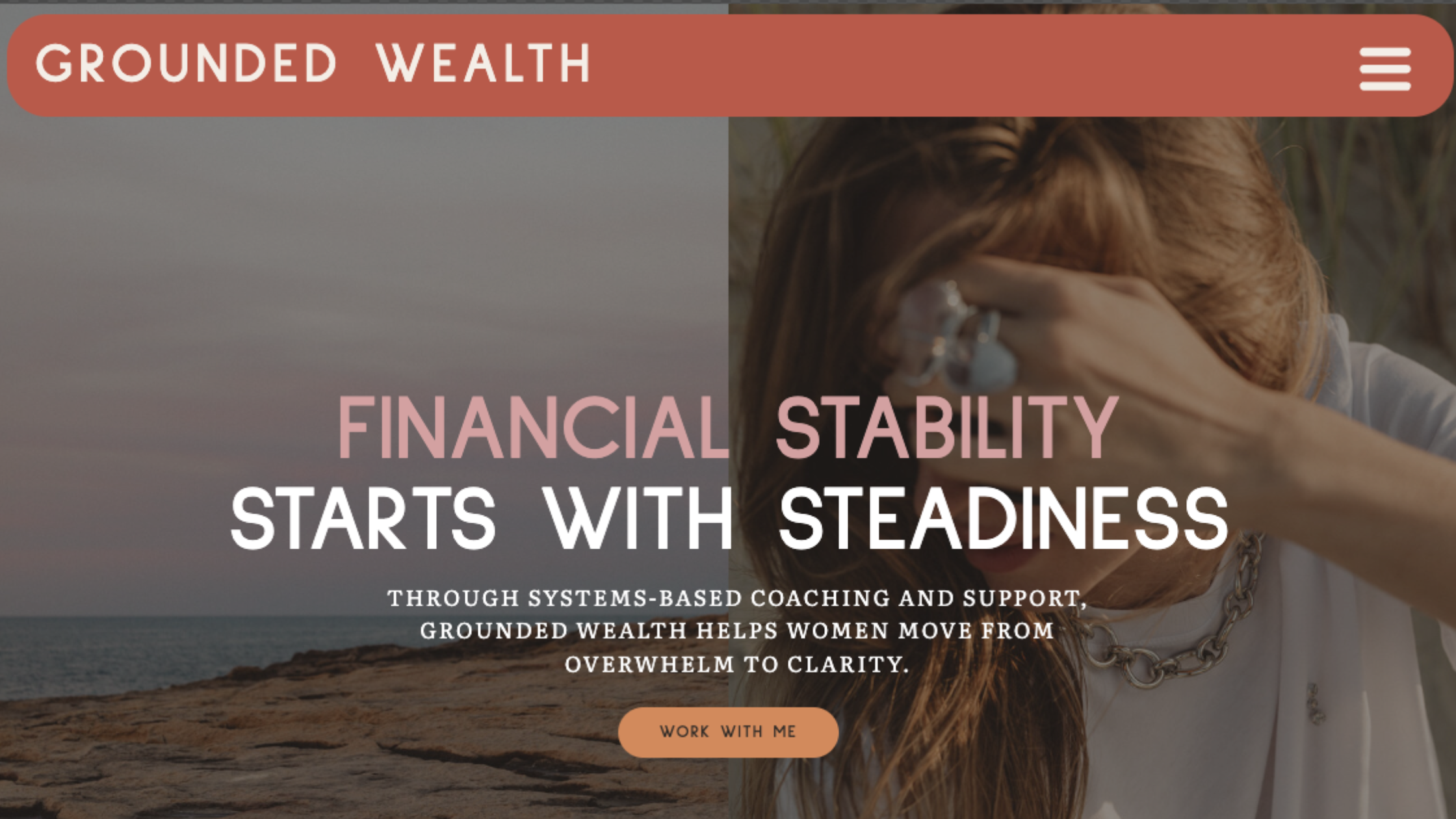
The hero message on the homepage sets the tone immediately:
“Financial stability starts with steadiness. Through systems-based coaching and support, Grounded Wealth helps women move from overwhelm to clarity.”
A clear value proposition that filters the right people in.
Building the User Journey
When I build websites, I think about the journey visitors need to go on, not just the information they need to see. Each section is designed to move people deliberately from one emotional or cognitive state to the next.
The homepage guides visitors through recognition (“this is for me”), understanding (“this is what she does”), and invitation (“here’s how to move forward”). The color shifts support this progression—each new background signals a transition in focus.
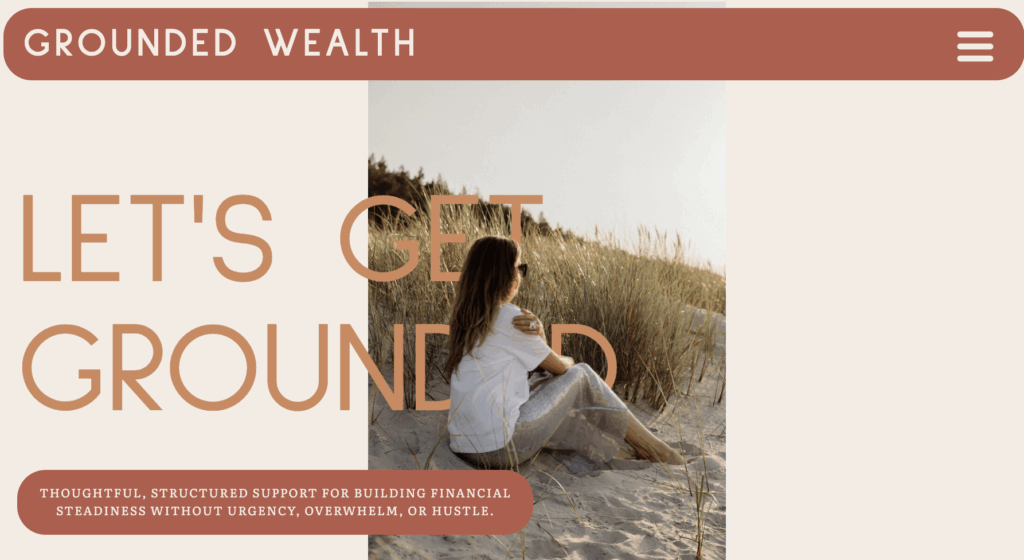
The Work With Me page uses the same approach. The hero section, “Let’s Get Grounded,” introduces all the ways to work with Ingrid in a clear, uncluttered layout. The structure makes decision-making easier for people who are already mentally overloaded.
Positioning The Grounded Wealth Framework
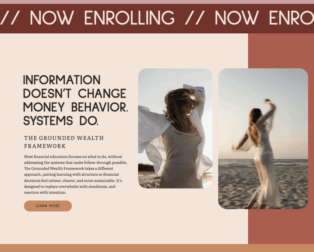
In a landscape where online courses are often dismissed as ineffective or dead, positioning Ingrid’s signature offer required intentionality.
The Grounded Wealth Framework isn’t marketed as “a course.” It’s positioned as a systems-based financial practice. The messaging emphasizes implementation, behavior change, and what you do with the information—not just consuming content.
The copy focuses on:
- Sustainable habits over quick wins
- Emotional regulation alongside financial strategy
- Systems that feel steady, not restrictive
The dedicated sales page for the Framework uses long-form, editorial-style layout with minimal CTAs, restrained visuals, and an emphasis on who it’s for and who it’s not for. The goal was to create a sense of thoughtfulness and depth, not urgency.
Weaving the Catalyst Moment Throughout
The beach moment (barefoot in the sand, ocean at her ankles, finding steadiness in the pause) wasn’t just backstory. It became the conceptual anchor for the entire brand experience.
The brand photography featured sunset beach settings with elevated styling: beautiful pieces that represent the financial freedom and intentionality Ingrid has built. We incorporated these photos throughout the website. The color palette was memory-coded:
- Cream → sand
- Blush clay → skin warmth at dusk
- Burnt apricot → sky just before sunset
- Soft rust → grounded earth tones
- Oxide red → depth, resolve, weight
This gave the visual system permission to lean into warmth and repetition without explanation. The colors were tied to the emotional arc of Ingrid’s own story.
Reflecting on the Catalyst Moment
This project came together at the intersection of visual identity, strategic messaging, and user experience design.
The site reflects the catalyst moment that shaped the brand (warmth, grounding, steadiness) while making it unmistakably clear what Ingrid does and who she serves. The color palette moves and shifts like a sunset, preventing the design from feeling static. The copy does the heavy lifting, ensuring that clarity never gets lost in metaphor.
Grounded Wealth is a brand that feels warm and inviting without sacrificing seriousness. A website that guides thoughtfully without pushing. A digital presence that honors the emotional work of changing your relationship with money.
