If you’re staring at Pinterest boards and color wheels trying to find “your vibe,” you’re not alone. Choosing brand colors is one of the most exciting (and overwhelming) parts of building your brand as a coach. But it doesn’t have to feel like a guessing game.
Whether you’re launching a new coaching business or giving your brand a well-deserved refresh, this guide on how to choose your brand colors will help you confidently choose brand colors that:
- Reflect your personality and values
- Attract the right clients
- Look amazing across your website, social media, and marketing materials
And I’ve included 5 done-for-you color palettes you can swipe today.
TL;DR
Choosing your brand colors? Keep these takeaways in mind:
- Your brand colors should create an emotional connection with your audience
- Choose 1 primary, 2–3 supporting, and 1–2 neutral shades for versatility
- Always test your palette across platforms before finalizing
- Accessibility matters. Contrast and readability aren’t optional
- Not sure where to start? Swipe one of the 5 done-for-you palettes matched to different coaching styles
Doesn’t matter if you want to go bold, calm, creative, or grounded, there’s a palette here for you.
Table of Contents
Why Brand Colors Matter More Than You Think
Your brand colors do more than just “look pretty.” They shape how people feel when they interact with your business. Colors can influence trust, connection, and whether someone sticks around long enough to click that “book a call” button.
Here’s why they matter:
- First impressions: Your website and Instagram grid speak before your words do
- Emotional connection: Color psychology affects how safe, energized, or inspired your audience feels
- Consistency: A cohesive palette builds recognition and trust over time
What to Know Before You Choose Your Brand Colors
Know Your Brand Vibe + Audience
Think about your coaching style and ideal clients. Are you bold and empowering? Gentle and grounding? High-end and structured?
If you’re not sure, take the What’s Your Website Style? Quiz to get matched with a template that reflects your energy.
Think About How You Want People to Feel
Do you want your audience to feel energized, safe, challenged, seen? Color evokes emotion. Soft neutrals feel calm. Earthy tones feel grounded. Bright colors feel bold and energetic.
Consider Contrast + Accessibility
You want your colors to work across screens and devices. That means:
- High enough contrast for text to be readable
- Not relying on too many similar shades
- Being mindful of accessibility (e.g., color blindness)
How to Choose Your Brand Colors (Step-by-Step)
Pick Your Primary Color
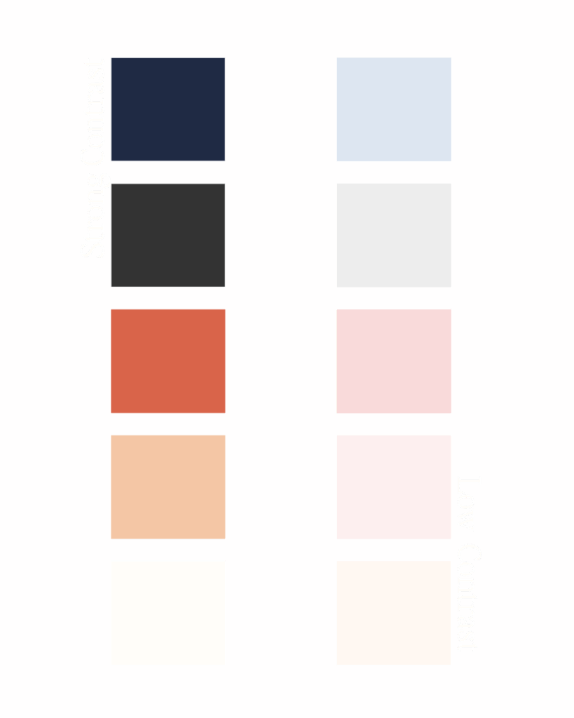
This is your anchor. It should reflect your brand personality and show up most frequently. Examples: deep green, warm terracotta, soft blush, ocean blue.
Choose 2–3 Supporting Shades
These bring variety and reinforce your primary color. Choose tones that complement and expand on your message.
Add Neutrals to Ground It
Neutrals like white, beige, charcoal, or soft gray help everything feel clean and cohesive. Use them for backgrounds, text, and breathing room.
Test It Across Platforms (Not Just a Mood Board)
Try your colors in Canva, on Instagram post mockups, and inside a website layout. What looks dreamy in a swatch may feel off when used on your homepage.

Done-for-You: 5 Color Palettes You Can Steal Today
Each palette below includes a vibe name, HEX codes, and a quick note on who it’s great for. Feel free to adjust tones slightly to fit your brand. These are a starting point.
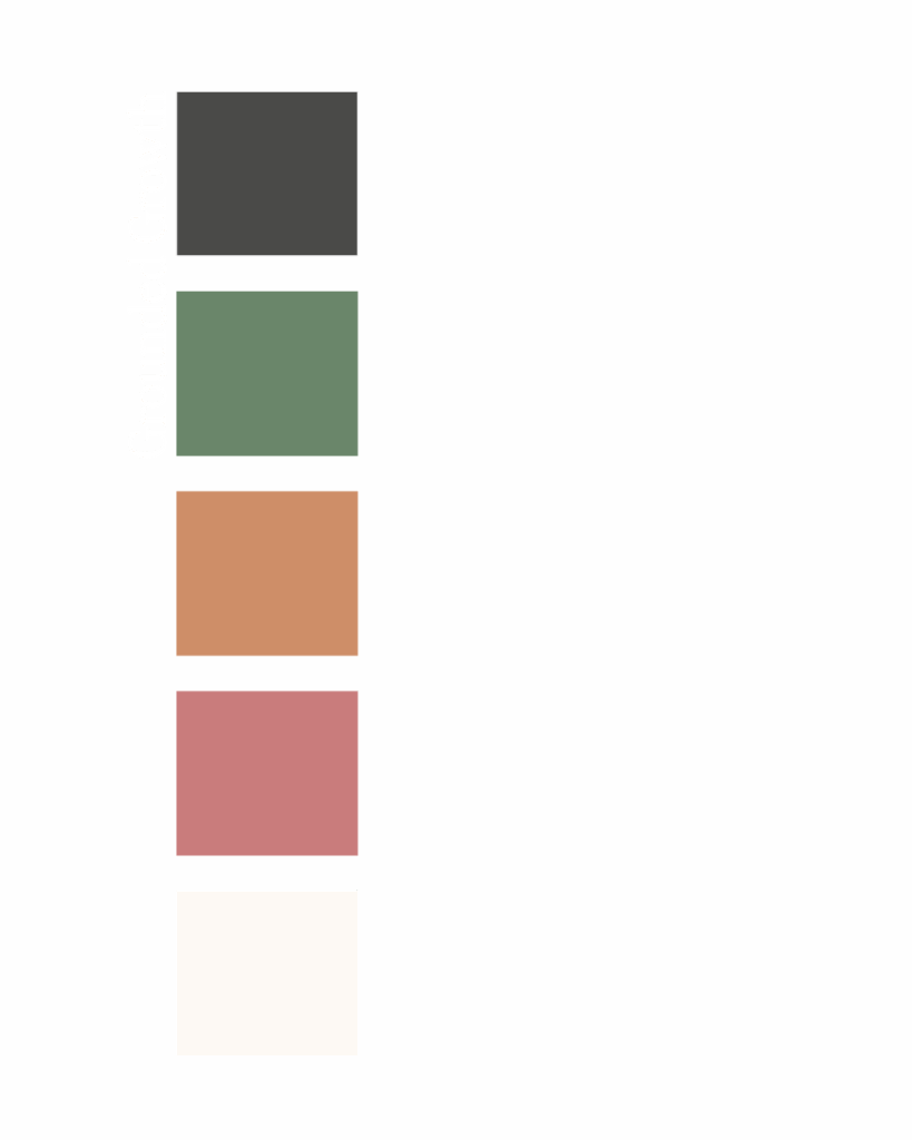
1. Grounded Growth
For: wellness coaches, nutritionists, mindfulness mentors
- Charcoal Brown: #3C3A36
- Deep Sage: #6A866A
- Terracotta Clay: #CE8E68
- Dusty Rose: #C97C7C
- Warm Cream: #FDF9F4
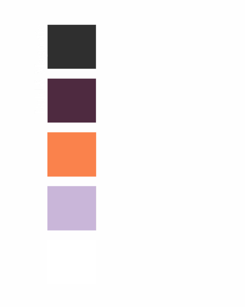
2. Bold & Magnetic
For: business coaches, mindset mentors, transformational leaders
- Charcoal Gray: #2F2F2F
- Rich Plum: #4E2A40
- Tangerine: #FA824C
- Cool Lilac: #C9B6D9
- Bright White: #FFFFFF
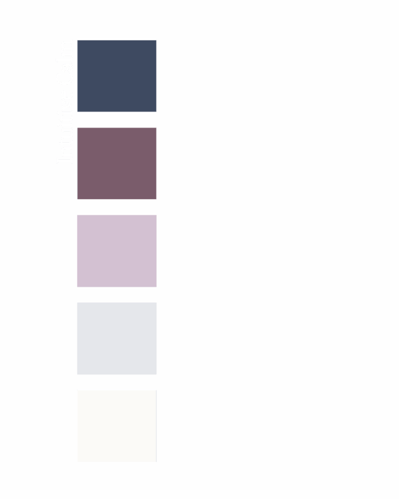
3. Intuitive Calm
For: spiritual coaches, healers, inner work practitioners
- Twilight Navy: #3E4A61
- Dusty Plum: #7A5C6B
- Soft Lavender: #D3C1D2
- Cool Mist: #E5E7EB
- Soft White: #FBFAF7
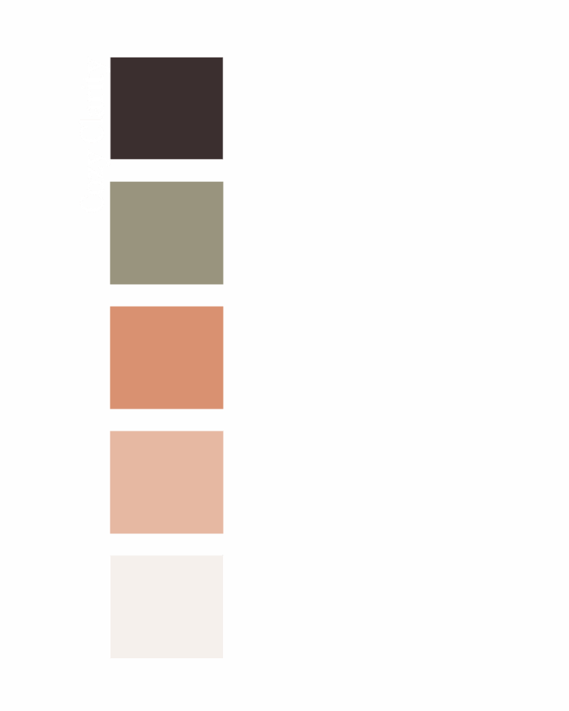
4. Cozy Clarity
For: life coaches, grounded motivators, journaling + reflection brands
- Espresso Brown: #3B2F2F
- Dusty Olive: #99947E
- Burnt Peach: #D99171
- Soft Coral: #E6B8A2
- Almond Milk: #F5F0EC
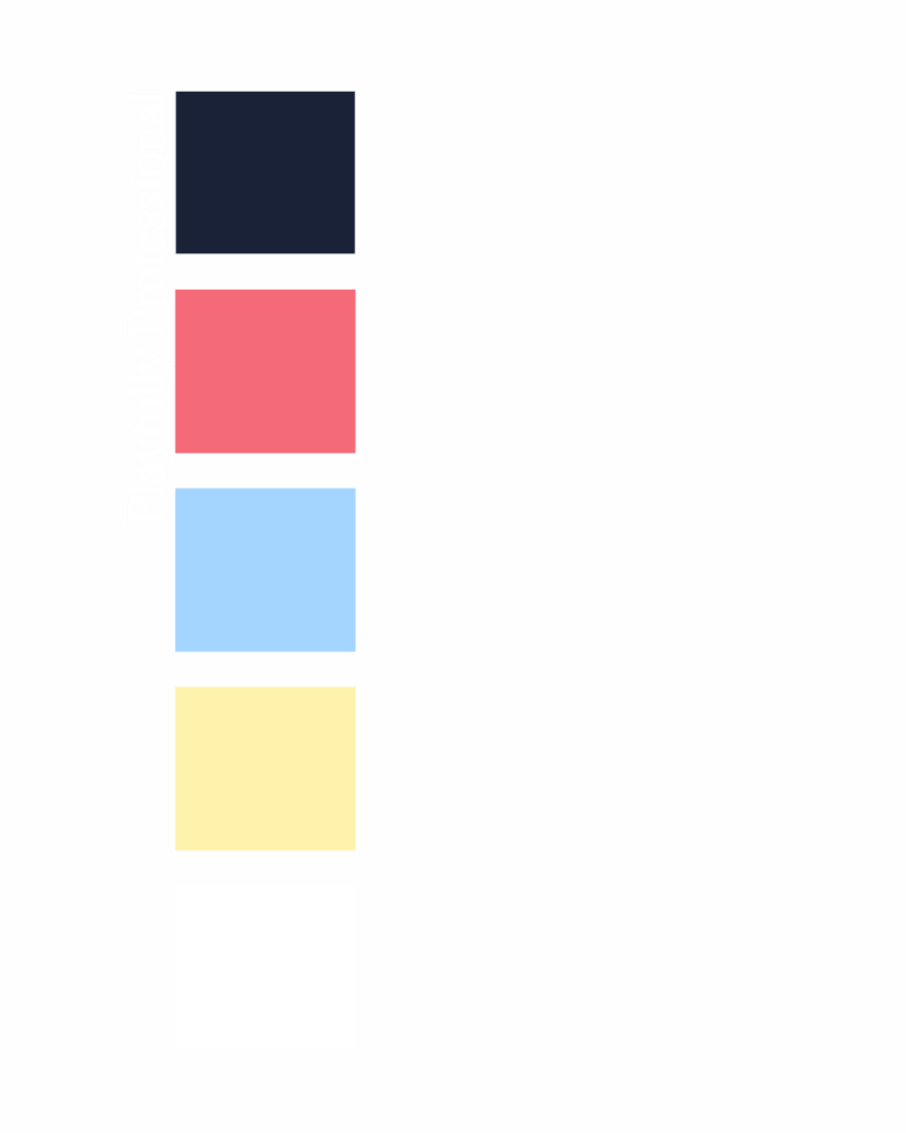
5. Playfully Professional
For: creative coaches, ADHD or multi-passionate mentors
- Deep Navy: #1A2238
- Punchy Coral: #F56A79
- Sky Blue: #A3D5FF
- Pale Yellow: #FFF2AD
- Bright White: #FFFFFF
Real Examples: How Branding Changes Everything
Your color palette influences how people perceive your business instantly. Here’s a side-by-side example using the same template in two completely different color schemes.
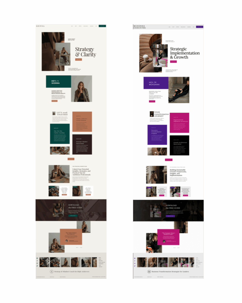
Notice how the energy shifts? One feels sleek and professional, while the other feels bold and energetic. Color is transformation.
Favorite Tools for Choosing Brand Colors
These free tools make choosing (and testing) your palette easier:
- Coolors.co: Great for generating palettes fast
- Adobe Color: For adjusting tone and contrast
- Canva: Easy mockup testing
You can also explore my template shop for design options that include color suggestions built in.
Want a Website That Brings Your Colors to Life?
Choosing your palette is one thing. Seeing it in action? That’s where the magic happens.
Explore our coaching website templates designed to make your brand shine—no coding, no second-guessing, just stunning results.
