

")
")
")
")


Margin House serves women-led service businesses: coaches, marketing agencies, consultants, OBMs, and fractional CMOs who are scaling fast and making bigger decisions. Revenue is real. Teams are growing. Rates are climbing. And still, there’s that quiet dread before tax season. That habit of avoiding the P&L. That question that never quite gets asked: am I actually profitable, or just busy?
And it was the center of everything we built for Margin House.
The Challenge
Isabella Torres’s business had evolved well beyond what the original positioning communicated. She wasn’t offering compliance support or basic reconciliation. She was functioning as a financial partner for founders making real, high-stakes decisions about hiring, reinvestment, pricing strategy, and growth.
But the website was still stuck in the past. Muted palette. Compliance-forward language. Safe, generic, and forgettable. The kind of site that gets overlooked by the exact client who needs what she actually offers.
There were several layers to solve:
- Reposition Isabella from bookkeeper to strategic financial partner
- Speak directly to financial anxiety without triggering shame
- Build a tiered offer structure that showed a clear path from entry point to long-term partnership
- Elevate the visual identity to match the caliber of the work and the client she was building for
Understanding the Audience
Margin House’s ideal client is a founder who is, by most visible measures, doing very well. Revenue is high. She has a team, consistent clients, and a brand that signals authority. She’s confident in her marketing and her sales. She is not confident in her numbers.
And she carries that privately. Because founders at her level don’t talk about dreading their QuickBooks login. They’re supposed to have this together.
That insight became the anchor for the entire messaging strategy. The real problem isn’t that her numbers are bad. It’s that she can’t see them clearly enough to trust them and that lack of visibility is quietly shaping every business decision she makes.
The messaging needed to name that without shame. To meet her where she actually is, not where she thinks she should be.
The Strategic Starting Point
Early on, Isabella said the sentence that shifted everything:
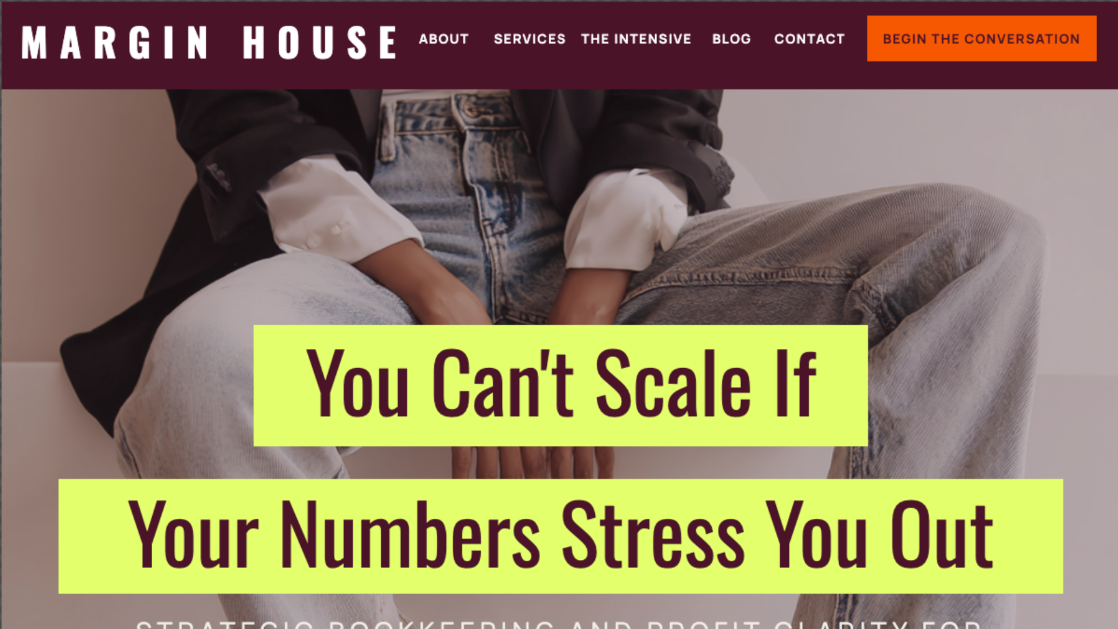
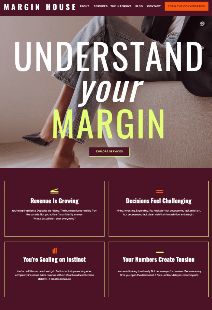
“You cannot scale if your numbers stress you out.”
That wasn’t a tagline we brainstormed. It was a belief she’d been carrying for years and had never put directly on her website. It named the problem her clients felt but rarely said. It identified the stakes without drama. And it positioned Isabella immediately as someone who understood the real issue. Not just the spreadsheets, but also the anxiety underneath them.
That line became the hero, placed at the top of the page where the right person would read it and feel immediately seen.
Everything that followed was built to support and deepen that opening. The hero subhead repositioned the service clearly: strategic bookkeeping and profit clarity for growth-stage founders ready to lead with data.
Offer Architecture: From Confusion to Commitment
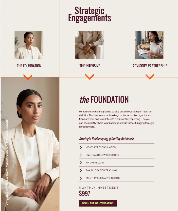
One of the most important strategic decisions in this project was how to structure the services. Founders at this level don’t want to sift through a list of offerings and figure out where they fit. The site needed to do that work for them.
We built three distinct engagement tiers, each with a clear role in the progression:
The Foundation
Ongoing strategic bookkeeping. Accurate books, clean reports, and consistent financial visibility. This is where the working relationship begins: a monthly retainer that moves the client from reactive to organized and keeps her there.
The Intensive
A focused financial reset. For founders whose books are behind, chaotic, or unclear. This is the deep-dive engagement that creates the baseline. It’s also often the entry point for clients who aren’t ready for ongoing work but need somewhere to start.
Advisory Partnership
Long-term strategic financial direction. Monthly advisory sessions, rolling forecasting, cash flow scenario planning, pricing strategy, and revenue stream analysis. This is CFO-level partnership for the founder who’s ready to stop managing her finances and start leading with them.
The hierarchy on the services page was designed to show clear progression without overwhelming. Each tier has a role. Nothing competes. And the structure itself signals that Isabella thinks in systems, which is exactly what her clients are hiring her to bring to their business.
Visual Identity: Designing for Composure and Control
The visual system was built to communicate one thing before a single word is read: this is not your average accounting firm.
Color Palette
Deep burgundy (#4b1328) is the foundation of the site. It reads as authority and control. It’s elevated, serious, and far removed from the generic blues and grays that dominate financial services. It signals that Margin House is operating at a different level.
Electric lime (#e3ff6b) is the strategic counterpoint. Used sparingly as an accent, it creates contrast and memorability without disrupting the composed, grounded feeling of the rest of the site. The tension between the two colors mirrors the brand’s core tension: structured and stylish. Grounded and energized.
A warm terracotta-orange (#f65802) appears in select accent moments, adding heat without aggression. Warm caramel (#885f45), soft linen (#e4d1b5), and a clean off-white (#efede5) round out the palette, keeping the site warm and human without softening the overall authority.
Typography
Oswald headlines bring editorial weight. They feel confident and modern without being ornamental, exactly right for a brand that wants to be taken seriously without feeling stiff. Manrope handles subheadings (set in all caps for structure) and body copy, where its clarity and warmth keep the site readable and human even in dense content sections.
Together, the typography communicates something important: this is a financial business that also has taste. That matters to the client Margin House is trying to reach.
Layout and Visual Hierarchy
The layout uses structured grid systems and deliberate color blocking to mirror the precision that’s central to Isabella’s work. Sections are clean and well-defined. Information hierarchy is clear. Nothing competes for attention.
The Transformation
What the site communicates now is categorically different from where it started.
Before: compliance-focused, transactional, generic
After: strategic, authoritative, partnership-oriented
Before: muted palette, forgettable design
After: strong visual identity that signals premium and intentional
Before: no visible pathway between offer tiers
After: clear, structured engagement architecture that guides the right client from first visit to commitment
The result is a digital presence that functions like the partner Isabella is for her clients: composed, clear, and entirely trustworthy. It positions Margin House not as a service provider, but as financial infrastructure for founders who are ready to scale with confidence.
Making the Right Person Feel Seen
This project came together at the intersection of copy, strategy, and design, which is exactly where I do my best work.
The most important decision wasn’t a color or a font. It was recognizing that Isabella already had the line that needed to lead. My job was to hear it, trust it, and build everything else to hold it up.
Margin House reflects a business that has grown into its own authority and a designer who understands that a website’s job isn’t to impress. It’s to make the right person feel seen.


")

")

