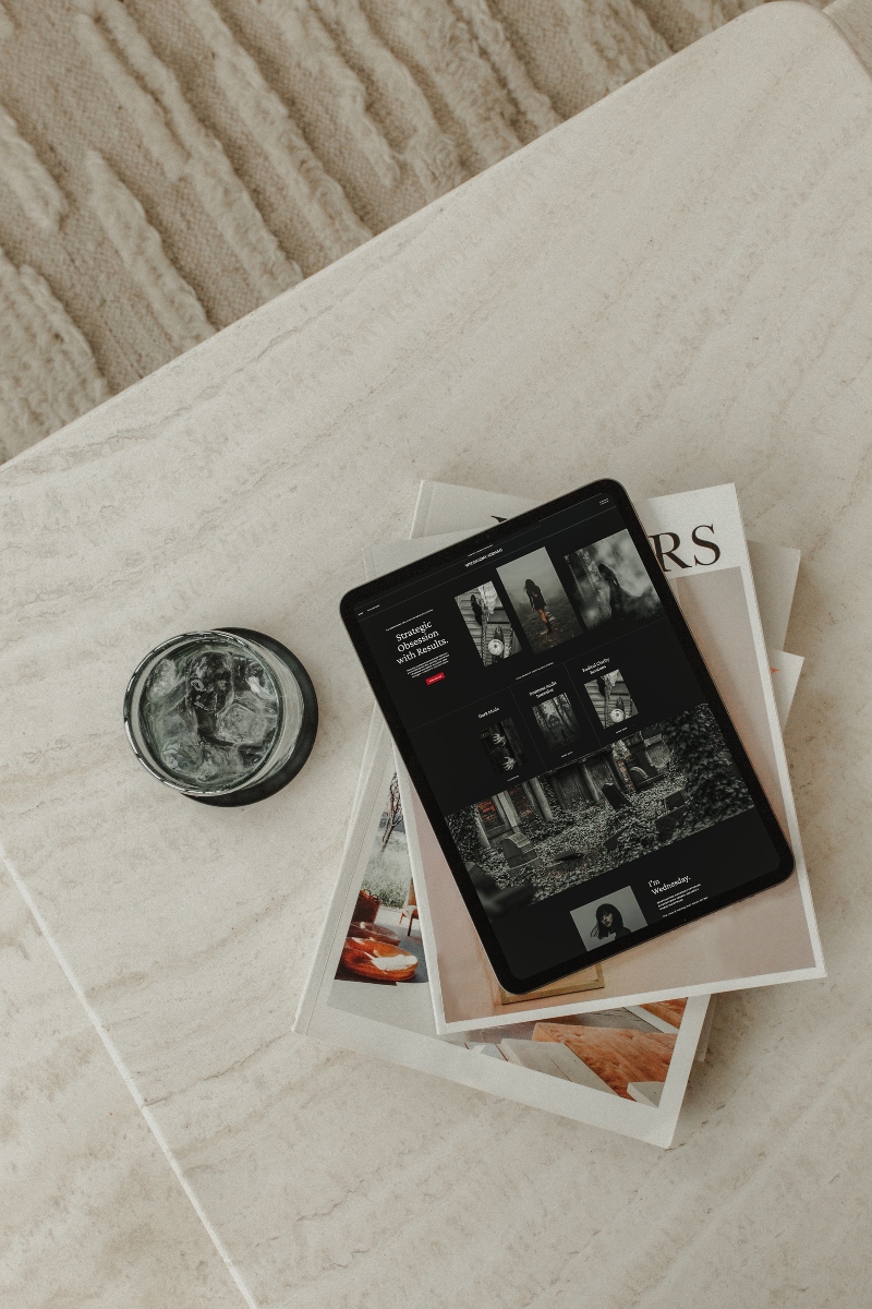
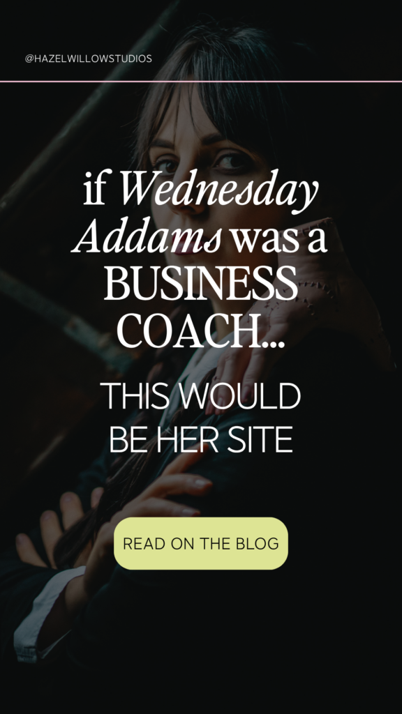
If Wednesday Addams offered business coaching, she wouldn’t waste time with fluff.
She’d audit your offers, slash your filler words, and deliver a brutal truth bomb with perfect posture and a blank stare. So naturally… I had to redesign my Zara Showit template to match.
The result? A business coaching website that’s sleek, gothic, and unapologetically sharp.
This isn’t just a moody makeover—it’s a full case study in what it looks like when personality meets performance in a high-converting Showit template. Whether you’re a straight-talking strategist or a no-nonsense business coach, this one’s for you.
>>Scroll down to watch the transformation reel.
Table of Contents
The Inspiration: Wednesday Addams, Business Coach
Let’s be honest—Wednesday wouldn’t just be any coach.
She’d be the kind who skips the mindset fluff and dives right into your pricing, your systems, and why you’re still offering 17 payment plans for a $99 offer.
Her website?
Direct. Minimal. Monochrome with a hint of menace.
And absolutely built for conversions.
This redesign was built on my Zara template—a clean, high-authority layout that pairs perfectly with bold positioning and structured offers. The edits? Strategic. The vibe? Dark academia meets business consulting.
Gothic Meets Strategy: Color + Fonts

The Wednesday-Inspired Palette
Dark, but not dreary. Elegant, not emo. Here’s the palette that sets the tone:
- Primary Black (#0F0F0F): Dominant and high-contrast. No-nonsense.
- Crisp White (#FFFFFF): Clean space for readability and contrast.
- Charcoal (#374151): Softer text tone without losing edge.
- Blood Red (#B91C1C): Accent only. Nails, links, CTA hover states.
This palette commands attention and creates structure—ideal for business coaching websites that want to convey clarity and control.

Typography Choices
- Headers: Crimson Text — literary, gothic, slightly dramatic (in a good way)
- Body: Inter — clean, modern, and efficient. It keeps the layout from feeling too heavy.
Together, these fonts say: “I’ve read the classics and I’m not here to sugarcoat your KPIs.”
Page Sections That Mean Business
This redesign leans into a “tell it like it is” coaching style—and the layout backs it up with strategic section flow and hierarchy.
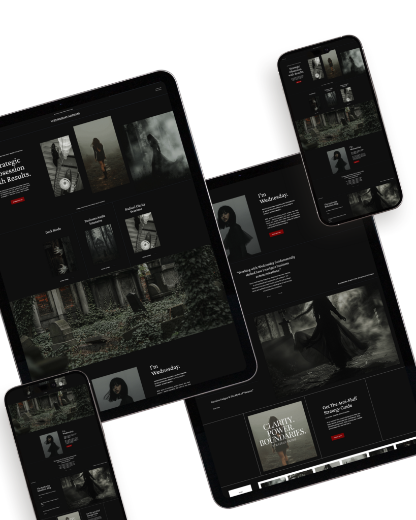
Hero Section: Lead With a Line
Headline:
“Strategic Obsession with Results”
Because being subtle doesn’t get clients.
Supporting text keeps it tight. No five-paragraph intro about “living your best life.” This site opens with a value-driven promise and backs it up with action.
Services: A Suite Built for Results
Wednesday’s fictional offers (but honestly? They kind of write themselves):
- Business Audit Intensives — a no-BS deep dive into your backend systems, offers, and missed revenue
- Dark Mode Group Program — a no-fluff cohort to restructure your systems
- Radical Clarity Sessions— for high-achieving entrepreneurs who crave brutal clarity
Layout-wise, we used service blocks with minimal text and clean hover effects.
Testimonials: Just the Facts
Client feedback is shown in a clean grid with dark overlays.
Nothing sappy. No heartfelt paragraphs about alignment. Just clear, measurable outcomes.
CTA: Clean, Clear, and Slightly Threatening
The button color? Blood red.
Is bold? Yes. Does it get your attention? Absolutely.
Why This Works for Business Coaching Websites
If you’re searching for business coaching websites that stand out, this is your sign that bold positioning works.
Too many coaching websites fall into the “soft pink + too many buzzwords” category. That’s fine—if you’re going for calm energy. But if you’re more “consultant with an edge,” then your site needs to communicate that in 3 seconds or less.
This design:
- Establishes authority with high-contrast visuals
- Communicates value clearly and quickly
- Uses strategy-backed layouts that guide the user journey
- Is built on a Showit template (read: no code, full control)
Your vibe doesn’t need to be dark to benefit from this structure. But if you’re tired of generic business coaching websites, this is proof you can show up as yourself and get results.
Want to Customize a Coaching Site with This Level of Edge?
You don’t need to be Wednesday Addams to pull this off. (Although a braid and black blazer never hurt.)
Grab the Zara Template
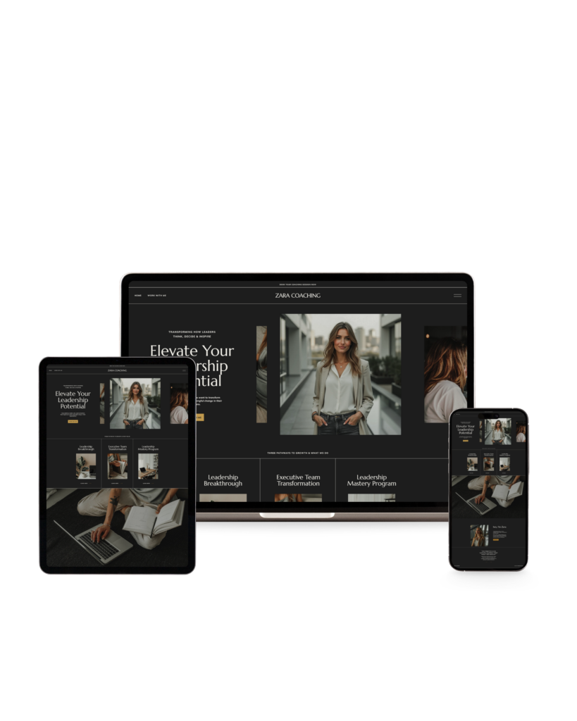
Zara is sleek, strategic, and designed for results.
Shop the Zara template here.
Watch the Transformation
Final Thoughts
Wednesday wouldn’t mince words—and neither should your website.
If your current site is a maze of confusing CTAs, fluffy copy, and too many pastel gradients, consider this your sign to shift.
Because business coaching websites should do more than look pretty.
They should perform.
And if Wednesday were reviewing your homepage?
She’d probably raise an eyebrow and say,
“This is a crime against conversion.”
Pin this post to reference your next redesign
DM me @hazelwillowstudios if you’re curious which template matches your brand vibe best.
