
resize")
")
")
")


")
")


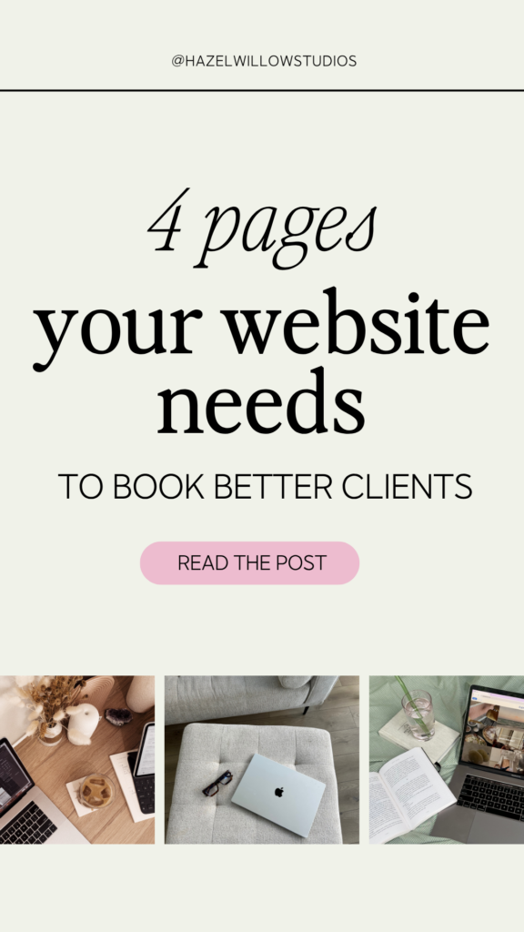
Your website doesn’t need to be big, flashy, or built over the course of six months.
(It also doesn’t need to be a digital scrapbook of every offer you’ve ever had, every certification you’ve ever earned, and every stock photo of a woman laughing at a salad you could find. Just putting that out there.)
But it does need to be strategic. And for most coaches, strategic coaching website design starts with four core pages that are done well, done intentionally, and done in a way that makes the right person feel like they’ve finally found their person.
If you’re an established coach who’s grown past your starter site or, you’re stepping into your next-level offers and your website hasn’t gotten the memo, this one’s for you.
Let’s break down exactly what each page needs to do and what to put on it so your site actually starts working for you.
Table of Contents
Page 1: Your Homepage: Make a Strong First Impression
Think of your homepage as a journey. One you’re intentionally designing from the first pixel to the last CTA. Every section is a pit stop. Some visitors will take action early. Others need to keep going. Your job is to make sure every pit stop leads somewhere intentional and that the path keeps moving forward.
Here’s how that journey should be structured:
Above the fold: clear, confident, one action
Build trust before you ask for anything
Once they’ve seen the above-the-fold, the work of the homepage is to walk them toward YES. And that YES needs to be earned. Show them you understand their world. Mirror their frustrations and their goals back to them. This is where empathy-driven copy does the heavy lifting, and where a well-placed testimonial or client result hits differently than it would anywhere else. Social proof is a companion to the journey, woven in where the doubt lives.
Strategic pit stops throughout
As they scroll, each section gives the right person a chance to take action when they’re ready. A mini introduction to who you are and how your background shapes what they’ll experience working with you with a clear path to your full About page for people who want to go deeper before they decide. A glimpse at your offers. A nudge toward the next step.
What to include:
- A headline that speaks directly to your ideal client’s reality (not a tagline that could apply to literally anyone)
- One primary CTA above the fold that reflects the action you most want them to take
- Empathy-driven copy that shows you understand their world before you ask them to do anything
- Social proof woven throughout rather than buried on a page nobody navigates to
- A mini about section that teases how your experience serves them, with a link to the full story
- Visuals that reflect your energy and attract the right people
Your homepage isn’t closing the sale. It’s earning the next click. And then the one after that.
Page 2: Your About Page: Let Your Experience Do the Selling
Here’s the thing nobody tells you about your About page: it’s not actually about you.
(Okay, it is. But also, it isn’t. Stay with me.)
When someone clicks to your About page, they’re not there to read your biography. They’re there to answer one very specific question: is this the right person for me? They’re reading about you to figure out something about themselves.
So yes, your About page is about you: your story, your background, your experience. But every single piece of it should connect back to what that means for them. Not in a vague “I’m passionate about helping people” way. In a specific, concrete, here’s-exactly-why-my-background-makes-me-the-right-person-for-this way.
Your experience as a coach, a copywriter, a former corporate something, a person who has lived the exact thing your clients are navigating — that’s not just interesting backstory. It’s the reason they should hire you over anyone else. Your About page is where you make that case.
(Go read your About page right now. Count how many times you mention something about yourself without connecting it to what it means for them. I’ll wait. If the number made you wince, you’re not alone. It’s genuinely hard to write about yourself in a way that makes it about someone else.)
What to include:
- An opening that meets them where they are before you introduce yourself
- Your story, experience, and background framed around what it means for the experience of working with you
- 2–3 specific moments or milestones that establish why you’re qualified (without making it a full LinkedIn download)
- A professional photo or two (this is SUPER important. Let them see the human behind the brand)
- A CTA that moves them toward your services or a conversation
The reader should finish your About page thinking: she gets this because she’s lived it, built it, obsessed over it. That’s the bar.
Page 3: Your Services Page: Get Clear on What You Offer
This is where most coaching websites fall apart. (And I’ve seen a lot of coaching websites.)
The Services page is either too vague (“I help you step into your fullest potential!”) or so long it reads like a terms and conditions agreement. Neither one converts. Your Services page needs to be clear, specific, and structured for decisions so the right person can land on it and immediately think: that’s exactly what I need.
The goal is to help your ideal client self-identify and reach out before they talk themselves out of it.
What to include:
- A clear breakdown of your offers: 1:1, group, course, intensive, whatever you’ve got
- Outcome-driven copy that focuses on results, not just what happens inside the container
- Pricing or a CTA to inquire (hiding your prices rarely works in your favor. At best it creates friction for people who are already ready. At worst it fills your calendar with discovery calls that were never going to convert because someone who can’t afford your offer will happily hop on a free call to find out.) Your Services page should do enough qualifying work that by the time someone reaches out, they already know what they’re getting into
- Short blurbs or expandable sections if you offer multiple options, so it doesn’t feel like a wall of text
- Buttons that actually lead somewhere like to a booking page, a sales page, a consult call, anything
If you only update one page on your coaching site, start here. This is where conversion happens.
Page 4: Your Contact Page: Make It Easy to Take the Next Step
The Contact page might seem like a formality. It’s not.
If it’s hard to find, hard to use, or missing important context, it can be the reason people don’t reach out. After everything your site has done to earn their trust, the Contact page can be the thing that loses them.
(That would suck. Let’s not let that happen.)
Make this page warm, welcoming, and low-friction. Your ideal client is already a little nervous about reaching out so don’t make them fill out a 14-field form to do it.
What to include:
- A short, simple form
- An optional dropdown for service interest or “how did you hear about me?” (useful data, not required)
- An alternate contact option like an email address or scheduler link
- Friendly copy that lowers the stakes: “Not sure what you need yet? Let’s talk.” goes a long way
- Set expectations for when they’ll hear from you. It builds trust and sets expectations before they’ve even hit send.
Once You Have These 4 Pages… Make Sure They Work Together
Strong coaching website design isn’t just about having the right pages. It’s about creating a cohesive experience. One that reflects your voice, positions your offers, and walks your visitor from stranger to client without them feeling like they’re being sold to.
A few things to layer in once the structure is solid:
Consistent voice throughout. Your homepage, About, Services, and Contact pages should all sound like the same person wrote them (because one person did). If your homepage is warm and direct and your Services page reads like a corporate brochure, people feel the disconnect.
Mobile optimization. The majority of your traffic is viewing your site on a phone. Every CTA, every form, every section, test it all on mobile before you call it done. Then test it again in three months.
Visual hierarchy that guides, not overwhelms. Use contrast, spacing, and font size to move the eye where you want it to go. Your design should make your copy easier to read, not compete with it for attention.
Internal links that keep people moving. Each page should have a clear path to somewhere else. Your About page links to Services. Your Services page links to Contact. Nobody should ever reach the bottom of a page and have nowhere to go.

Not Sure If Your Website Is Actually Working?
Before you overhaul everything, it helps to know what you’re actually dealing with.
I created a free Website Health Diagnostic: 18 questions that help you figure out whether your site is doing its job or quietly costing you clients. It covers everything from your homepage messaging to your CTA strategy to how your social proof is showing up (or not showing up) across your pages.
If your gut has been telling you something’s off but you can’t quite put your finger on it, this is where to start.
You’ll join my email list where I share website strategy, messaging tips, and the occasional thing nobody else is saying about what actually makes a coaching website convert. Unsubscribe anytime. No hard feelings.
And if you work through it and realize you need someone in your corner to fix what you find, I’d love to talk.


")

")

